If you’re new to data analytics, Excel is the most convenient tool available. The spreadsheet allows you to organize data and analyze trends. This can help you improve your marketing strategies. There are several functions within Excel that you can use for data analytics. Using one or more of these functions will help you analyze data more efficiently. You’ll be able to make better decisions for your business.
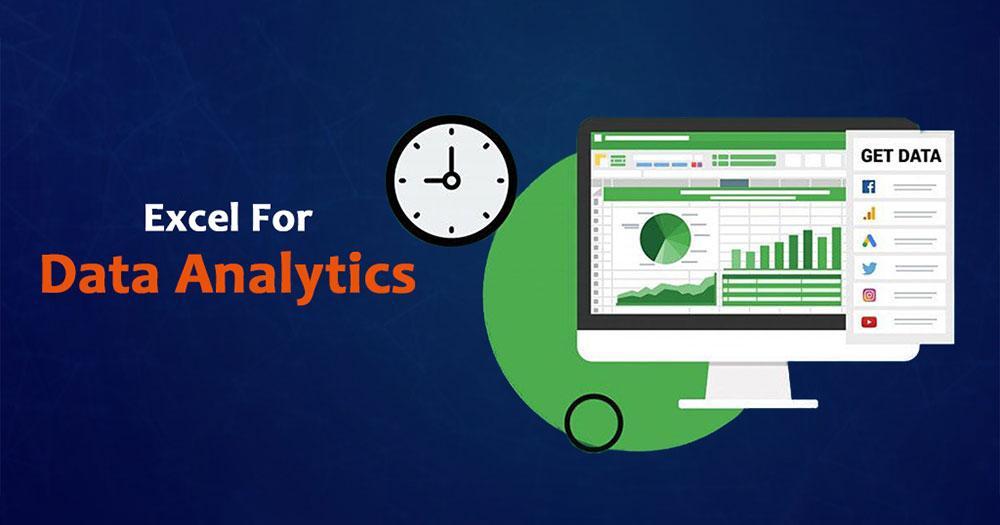
Use of Excel for Data Analytics
Excel is a powerful & widely used tool for data analysis. It offers you to collect data from various sources, sort it, filter it, and create charts in various formats. The powerful features of Excel include ad hoc analysis, conditional formatting, ranges, tables, text functions, financial functions, and more. Using Excel can make your work much easier. Some of these powerful features include HLOOKUP and VLOOKUP functions, which can be used to find a particular piece of information.
To be an efficient data analyst, you must understand how to use Excel formulas. These functions operate on the values inside of cells and product-specific information. For example, a formula can calculate the total sum of selected cells or find the lowest value of a group of cells. If you’re unsure about using advance excel to analyze data, you can sign up for Brainalyst’s Full Stack Masters Program in Data Science, Machine Learning & Big Data. The course will teach you how to perform the analytical tasks that most people will need.
Excel for Statistical Analysis
One of the features that Excel is excellent for is statistical analysis. It excels at tabulation and graphics and is a great tool for basic data management and statistical analysis. It can also handle many columns. For this reason, it’s an excellent choice for most users. The mentioned tips will guide you through the different types of statistical analysis and how to use Excel effectively for them. Once you have the basic skills needed, you can move on to more complex statistical analyses.
First, learn how to perform one-way ANOVA on a data set with one or more population groups. Suppose the samples are independent and that the variances are equal. You can also perform a two-way factor analysis with or without replication in Excel. Once you have the data, please enter it into the worksheet, and follow the steps to get the proper output. Afterward, use the data to perform regression analysis.
Excel for Regression
To perform regression in Excel, you first need to define a model. Linear regression can be used to find the best fit. To do this, add the Analysis ToolPak add-in to the Data tab. This add-in will enable you to perform statistical analysis in Excel. When you have this tool installed, you can go to File>Options>Add-Ins and select the Regression option.
The first step in the process is to create a new spreadsheet and add the dependent and independent variables. Then, click on the Data tab. Click on the Data Analysis group and choose Regression. Follow the steps below to fit a regression model. When you have completed the process, you can check the results to ensure that you’re using the correct model. The regression model you created will depend on the data you entered.
Once you have selected the independent variable, you’ll need to define the dependent variable. This will be the dependent variable. Ensure that the independent variable is on the X-axis. If you need to change the order of the graph, swap the columns in the worksheet or draw a chart from scratch. You can use the Statistical Functions for Regression in Excel to perform regression in Excel. You’ll need to add the Data Analysis ToolPak to access this feature.
Important Excel Functions for Analytics
Excel’s IF function allows you to create a logical test and decide what to do if the result is true or false. You may want to use this function when you need to find data values for analysis. You might have pasted data into Excel from other sources, but it may be in a format that Excel does not recognize. The value function can help you convert that data to the proper format. The value function recognizes most numbers formats, including those that Excel does not recognize.
Another useful function for data analysis is the COUNTIF function. This function counts the number of times a specific cell value appears. This function is great for extracting parts of a string or an address, for example. For example, you can also extract a specific number of employees within a department. You can use this function to extract data from many different fields, including text, and analyze it. In addition to extracting data from your data, Excel can help you visualize your findings.
Dashboard & Charts
When creating a data analytics dashboard in Excel, it’s important to choose the right format for the dashboard. The format determines how the dashboard is delivered and shared and its editing capabilities. Dashboards contain several elements, including static tables, pivot tables, dynamic charts, Excel gauge widgets, and non-charting objects. These elements help group similar data together for easy reference and understanding. However, it’s also important to consider how each element is presented.
Dashboards are great for quick overviews of various data reports. They help you skim through large amounts of data, making it easier for you to make the right decision and take action based on your findings. A dashboard also helps you track your KPIs and goals and provides you with timely indicators of what needs to be changed. The dashboards that you create can include pie charts, bar charts, and other charts to show key information about your business.
The design of your dashboard must be based on your stakeholders’ needs. Each element of the dashboard should serve a specific purpose. You must also choose a format that allows you to track your key performance indicators (KPIs) regularly – whether for the entire company or division-by-division. Remember to ask the right questions to make the most of your dashboard & a better understanding of your audience.
Excel Macros & VBA
Using Excel Macros and VBA for Data Analytics can automate the process of generating reports using charts and other data visualizations. VBA can be complicated but is much easier to use when done with a Macros tool. To start using VBA, click the Developer tab on the Excel ribbon and select the option to “Show Developer Tab.” If you don’t see it, click the Office button and select the options. Select the Developer tab and then click Ok. From here, right-click on the label to open the Properties dialog box. Type the desired caption and click OK.
Finance professionals often work with large volumes of data. In order to make accurate decisions, they need to analyze this data. Using VBA, finance professionals can create automated macros that feed data into Excel. This lets them analyze data much faster and more accurately than would be possible with manual input. VBA also offers a high level of flexibility, allowing them to automate a wide range of previously manual tasks.
The major use of Excel for Data Science
Although Excel is not the only tool used in the analytics process, it is one of the most reliable and inexpensive tools. Its structure and design make it ideal for manipulating 2-dimensional data and can be used to format, colorize, and share results with others. This capability is useful for lower-level roles within data science teams or those without mature data analysis processes. Moreover, it’s useful for quick calculations.
Many data scientists use Excel for data science projects, but it’s not the best tool for advanced modeling and analysis. It’s too limiting to work with complicated models, and the lack of built-in models makes it less useful for experienced data scientists. It is easy to make mistakes with Excel, and the spreadsheet’s format often amplifies mistakes. Despite its limitations, Excel is a vital tool for data scientists.
Moreover, it can be used for data entry. Since it provides a large storage area, Excel makes it easy to input and view data. In addition, Excel users can also create customized forms for data entry. They can then analyze the data and make it useful. This way, data can be derived from raw data, which can then be incorporated into business reports and marketing materials. Using Excel, business owners can organize their scenarios, which can lead to better decisions.
Conclusion
Excel is the most popular spreadsheet available. In fact, new computers come preloaded with Excel. Its extensive set of statistical functions and Data Analysis ToolPak make it an obvious choice for data analysis. However, it has its limitations and is not recommended for complex tasks. Better alternatives are available if you have to perform data analysis on a large scale.
Spreadsheets can be useful for small-scale data projects. They can help you understand what your goals are, what data sources are best for what purpose, and how to translate them and make decisions based on them. They are also a microcosm of a larger project. This microcosm can provide valuable insights that you can use for large-scale analysis. Ultimately, Excel can help you make informed decisions based on data analysis.