Excel Basic to Advanced
Microsoft Excel is a widely used software application designed for organizing, analyzing, and managing data in a tabular format. With its comprehensive spreadsheet capabilities, Excel provides a convenient platform for storing and processing various types of records. It offers users the ability to input, store, and manipulate data, as well as perform calculations and generate visual representations of the information.
By leveraging Excel’s features and functionalities, users can efficiently sort, filter, and analyze data to gain insights and make informed decisions. The program facilitates tasks such as creating budgets, tracking expenses, managing inventory, and conducting financial analysis. It also supports the creation of charts, graphs, and pivot tables, enabling users to present data in a visually appealing and understandable manner.
History: The primary model of Excel turned into launched in 1985. Underneath the name of Microsoft Multiplan.
What is Excel?
Excel is a complete-featured spreadsheet software program evolved by means of Microsoft. It lets in users to store, arrange and edit statistics in a spreadsheet format. Excel’s breadth of abilities has made it a famous device for individuals and organizations. Excel 16,384 columns and general range of 1,048,576 rows.
What is Advance Excel?
Advanced Excel refers to using the more complex and advanced features and functions of Microsoft Excel to perform advanced data analysis, create complex and dynamic charts, automate repetitive tasks using macros, perform data consolidation and linking, create interactive dashboards and reports, and more.
It requires a deeper understanding of Excel’s capabilities and a good knowledge of its functions and formulas. Advanced Excel is widely used by data analysts, business professionals, and others who regularly work with large amounts of data. Some examples of advanced Excel features include pivot tables, data validation, conditional formatting, VLOOKUP, and macros.
Key Features of Advance Excel
The key features of Advanced Excel include:
- Pivot tables: A powerful tool for summarizing and analyzing large amounts of data in a few clicks.
- Macros: A way to automate repetitive tasks and save time by recording a series of actions that can be replayed at the touch of a button.
- Conditional formatting: A feature that allows you to highlight cells based on certain criteria, making it easy to identify trends and patterns in data.
- Advanced formulas and functions: Excel has a wide range of built-in formulas and functions that can be used to perform complex calculations, such as SUMIF, COUNTIF, VLOOKUP, and INDEX MATCH.
- Data validation: A feature that lets you control what can be entered into a cell, ensuring that your data is accurate and consistent.
- Charts and graphs: Excel has a variety of chart types to choose from, making it easy to create visually appealing charts and graphs to represent your data.
- Data analysis tools: Excel includes a range of data analysis tools, such as regression analysis and scenario analysis, that can help you gain insights from your data.
- Data linking and consolidation: A feature that allows you to link data from different sources and consolidate it into a single report or dashboard.
Introduction to the Excel interface
- Overview of the Excel user interface .When you open Excel, you will find a simple, intuitive interface.
- The ribbon, tabs, formula bar, worksheet area, and status bar are the Excel window’s key features.
In Excel main important interface options
AS in image shows:
- Ribbon: Ribbon contains tabs- ‘Home’, ‘Insert’, ‘page’,’ layout’, ‘formulas’, ‘data’, ‘view’, ‘developer’ its group of contain.
- Title bar: it is top of the workbook and shows the name of the workbook.
- Formula bar: its shows whichever sell is selected and which formula is written and we edit that.
- Excel Options. Clicking on this button displays a dialog box that offers you the ability to change various configuration parameters. It also contains the Add-Inoption
- Status bar: Its shows the status of the sheet-like what function, the formula is performing
- Row header: It is on the left side of a sheet and shows the row serial. (1,2,3..)
- Column header: it is top of the worksheet and the label name shows (A, B, C, D…)
Cells, columns, and rows:
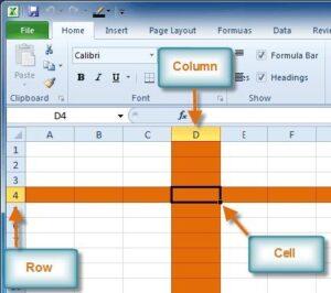
- Cells: In Excel, the basic building blocks are cells. They are the rectilinear shapes created by the meeting of the rows and columns. Data, like numbers, text, formulas, and functions, are stored and shown in cells. Each cell has a distinct address or reference that is represented by a letter and a number (e.g., A1, B2, C3, etc.). To successfully do calculations, produce charts, and analyze data, cells allow you to input, modify, and change data inside the boundaries of a spreadsheet.
- Column: In Excel, columns are vertical lines that run the length of a spreadsheet, from top to bottom. At the top, they are labelled with alphabetical letters going from A to Z and beyond (e.g., AA, AB, AC, etc.). In order to organize data vertically, columns are essential. They are also frequently used to categories or classify data. They enable you to organize similar data into groups and carry out numerous tasks including sorting, filtering, and applying formulas.
- Rows: In an Excel, rows are horizontal lines that run from left to right. They are distinguished by numerical labels on the left side that start at 1 and increase as you descend. Rows are utilized to represent individual records or entries and act as containers for organizing data horizontally. They offer a predetermined structure for handling and storing data in spreadsheets.
- See the below image:
Tab and Group in Excel
- Tabs and groups in Excel are crucial components of the ribbon interface that categorize different operations and capabilities.
- Tabs: Tabs in Excel are the main categories or sections displayed at the top of the ribbon. Each tab represents a different aspect or functionality of Excel. Here are some commonly used tabs:
- Home Tab: The primary categories or sections seen at the top of the ribbon in Excel are called tabs. Each tab represents a different Excel feature or facet. Following are some frequently used tabs:
- The Home tab has widely used formatting, cell editing, and data manipulation tools.
- Insert Tab: You can add a variety of items to your spreadsheet using the Insert tab, including tables, charts, and photos.
- Page Layout Tab: The Page Layout tab provides choices to change the page structure, margins, and printing preferences.
- Formulas Tab: The Formulas tab gives users access to a variety of built-in features and capabilities.
- Data Tab: The Data tab contains tools for importing, sorting, filtering, and analyzing data in Excel.
- Review Tab: You can spell-check, proofread, and add comments or protection to your workbook using the Review tab’s functionalities.
- View Tab: You may adjust your spreadsheet’s view settings, such as zooming in or out and moving between different views, using the View tab.
- Groups: The groupings, which are subcategories of linked commands, are further broken down into each tab. Groups facilitate the organization of the tab’s features. You will discover groups like Clipboard, Font, Alignment, and Number, for instance, under the Home tab.
- Check the below images:
Tabs 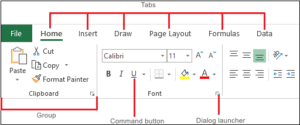
Group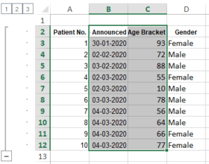
How to Use Quick Access Toolbar (QTA) in Excel:
- The quick access toolbar (QAT) In Excel, offers a practical way to quickly access frequently used commands and functions.
- You can save time and effort by customizing and adding shortcuts to crucial tools.
- No matter which ribbon tab is selected, the quick access toolbar in excel is always visible and accessible, making it simple to use your preferred commands from any location inside the application.
Here are the key points and steps to utilize the Quick Access Toolbar in Excel:
Adding Commands to the Quick Access Toolbar in Excel:
- The QAT’s right end has a downward-pointing arrow; click on it.
- Choose “More Commands” from the dropdown menu.
- Select the required command from the “Choose commands from” dropdown list in the Excel Options dialogue box.
- To add a command to the QAT, select it and press the “Add” button.
- To add more commands, repeat the process.
- To save your changes, click “OK.”
Customizing the Quick Access Toolbar:
- The QAT’s right end has a downward-pointing arrow; click on it.
- A custom quick access toolbar in excel can be selected.
- The up and down arrows in the Excel Options dialogue box are used to reorder the commands.
- Select the command you want to remove from the QAT, then click the “Remove” button.
- To save your customization, click “OK.”
Moving the Quick Access Toolbar:
- The quick access toolbar (QAT) in excel is usually positioned above the ribbon. However, if you’d like, you can place it underneath the ribbon.
- You may “Show Quick Access Toolbar Below the Ribbon” by performing a right-click on the QAT.
- Check the below image:
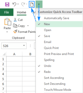
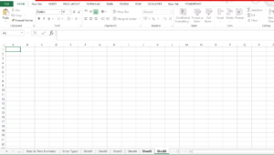
Difference between Workbook & Worksheet in Excel
Workbook:
- It consists of more than one sheet. Each serves as single worksheet inside a bigger series. It serves as a box for facts, calculations, and evaluation. Each workbook has a unique filename and might include one or extra worksheets.
Worksheet:
- This is a single file that may be used for all statistical calculations, storing, analyzing, and entering. Users can upload data into the cells, which are made up of rows and columns that intersect. Worksheets give you a structured area for performing computations, creating charts, and applying features and information formulation.
Check below image:
How to Enter and Modify the Data in Microsoft Excel
Entering and modifying data in Microsoft Excel involves various actions that allow for data input, manipulation, and organization. Here are the steps and procedures involved in entering and modifying data in Excel:
How to Enter Data in Excel:
- To input data into a cell in Excel, follow these steps:
- The cell where you want to add the data should be clicked.
- The appropriate data into the keyboard.
- An insertion point that shows where the entered data is located within the cell appears as you type.
How to Modify Data in Excel:
- Excel provides several commands for modifying data, such as copying, pasting, and cutting. Follow these steps to perform modifications:
- Selecting the cell or range of cells to copy, performing a right-click, and selecting “Copy” from the context menu will copy the selected data.
- To enter the copied data, navigate to the desired cell or range, right-click, and choose “Paste.”
- Data can be sliced by using the same procedure as copying, but selecting “Cut” rather than “Copy.” The data is relocated as a result of this action.
How to Add and Delete Rows and Columns:
- Excel provides quick ways to add and remove rows and columns. This is how:
How To add a new row in Excel:
- To insert a new row, simply right-click the desired row number and select “Insert.” Excel adds the row above the currently selected row automatically
How to delete a row in Excel:
- Right-click on the row number and choose “Delete” to remove a row. As an alternative, you can choose numerous rows and then click “Delete” to delete them all at once.
How to Insert a New Column in Excel:
- Create a new column by selecting “Insert” from the context menu when you right-click on the desired column’s letter. The column to the left of the clicked column is inserted by Excel. To repeat the insert column process for more columns, hit the F4 key.
Values and Formatting Options in Excel

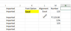
- You can see the basic formatting options in excel in the image, including font, alignment, number, styles, cells, and editing.
- In this, all formatting options there are sub multiple options: can see for editing font, style, size, number, how to align, warp text, number, board, filling color, and inserting rows, and columns.
Below can find details about the options.
values:
- A value in Excel is the actual text or numeric information entered in a cell. These might be tuples of numbers, dates, or text. Simply select the cell and type the value you want to insert.
Formatting options in Excel:
Excel offers many formatting options to improve the appearance of your cells and data. Here are some important formatting options:
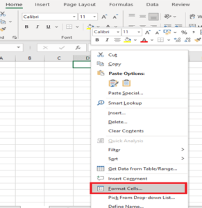
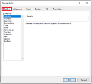
- Number formatting: You can change the number format. B. Currency, Percentage, or Date Formats. To apply number formatting, select a cell, right-click, select Format Cells, and go to the Number tab.
- Font formatting: In Excel, you can change the font, size, style (bold, italic, underline), and color. Select a cell, right-click, select Format Cells, go to the Font tab, and change the font formatting.
- Cell Alignment: You can align content in cells to the left, right, center, or adjust vertical alignment. Use alignment options on the Home tab or the Format Cells dialog box.
- Fill and border formatting: You can use patterns, add borders around cells or ranges of cells, and modify the background color of cells in Excel. From the Home tab or the Format Cells dialogue box, you can access these settings.
- Conditional formatting: This feature allows you to highlight cells based on certain conditions or criteria. It helps draw attention to data that meets specific requirements. On the Home tab, look for conditional formatting options.
- Cell style: Excel provides predefined cell styles that provide a consistent formatting theme throughout your workbook. You can apply cell styles from the Cell Styles gallery on the Home tab.
- Custom formatting: You can design custom formats in Excel to display values in a certain way. By employing unique codes, you can define your own forms. From the Format Cells dialogue box, select this option.
Check the below images:
How to use Flash Fill (CLT+E) in Excel with examples
Flash fill in excel is a powerful feature in Excel that automates data formatting and extraction tasks, saving you time and effort. It intelligently recognizes patterns in your data and automatically fills adjacent cells based on the recognized pattern.
Activating Flash Fill in Excel: To activate Flash fill in Excel:
- Enter a few examples of the desired formatting or extraction manually in a column adjacent to the data you want to modify or extract.
- Excel will detect the pattern based on your examples and suggest the Flash fill option.
- Press Ctrl+E or click the Flash fill button in the Data tools group on the Data tab to apply the suggested pattern to the rest of the column.
Formatting Data in Excel:
- Using a pattern, Flash fill can format data quickly. For instance:
- Enter a few initial names in the adjacent column using the desired format if you have a column of names in the style “First Name Last Name” and wish to extract only the first names into a separate column.
- Excel will identify the pattern and recommend using Flash Fill.
- Apply Flash fill, and Excel will use the pattern you gave to automatically fill the adjacent column with the extracted initial names.
Extracting Data in Excel:
From a column, Flash fill can extract particular data items.
- To extract only the domain names from a column of email addresses, for instance, write a few instances of the required domain names in the adjacent column.
- When a pattern is detected, Excel will recommend the Flash Fill option.
- Apply Flash fill, and according to the pattern you specified, Excel will extract the domain names from the email addresses.
Custom Patterns: Flash Fill can handle various custom patterns based on your data. You can use functions, text manipulation, and formatting options to create complex patterns for data transformation.
Review and Adjustments: It is important to review the results of Flash Fill and ensure they are accurate. Excel’s Flash Fill feature is intelligent but may not always produce the desired output. Make adjustments or provide additional examples to guide Excel in recognizing the pattern correctly.
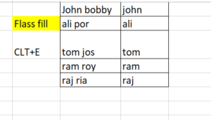
- If you establish a pattern by typing the full name in a column, the Excel Flash Fill feature will fill in the rest for you based on the pattern you provide.
- By utilizing Flash Fill in Excel, you can automate data formatting and extraction tasks, reducing manual effort and increasing efficiency. The feature’s intelligent pattern recognition capabilities make it a valuable tool for working with large datasets or performing repetitive data transformation
- The below Image shows when enter clt+E it will paste the remaining text into the next cell.
- In Excel custom number formatting, single and double commas (,) have specific meanings when applied in a formula. They are used to control the number of thousands separators or scale the number by a factor of one thousand.
Single Comma (,):
- When you use a single comma (,) in a custom number format, it signifies a thousands separator. Excel will use a comma to separate thousands in the number, making large numbers easier to read.
- For example, if you have a custom number format like “0,000,” and you enter the number 1234567, Excel will display it as “1,234,567.”
Double Comma (,,):
- When you use a double comma (,,) in a custom number format, it represents a scaling factor of one thousand. Excel divides the number by one thousand for each double comma.
Example:
- “0,000” will separate thousands with a comma.
- “0,,,” will scale the number down by a factor of one million.
- “0,,.0” will scale the number down by a factor of one million and display one decimal place.
Converting Text to column in Excel
Text to Columns in excel is a powerful Excel feature that allows you to split data in a single cell into multiple columns based on specified delimiters or fixed widths. It provides a seamless way to effectively organize and manage your data.
Activating Text to Columns Feature in Excel:
Follow these steps to enable Excel’s Text to columns feature:
- Choose the column in which the data you want to split is located.
- Go to the Excel ribbon’s Data tab.
- In the Data Tools group, select the “Text to Columns” button.
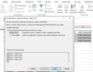
- Delimited vs Fixed Width: Depending on the layout of your data, you can select between two options in the Text to Columns Wizard: Delimited or Fixed Width.
- Delimited: When your data is divided by a specified delimiter, such as a comma, tab, or semicolon, choose the delimited option. The delimiter used to split your data is a choice.
- Fixed Width: When your data is segmented into columns based on certain character positions or widths, select the fixed width option. In the data preview section, you can click and drag to specify the column breaks.
Delimited Text to Columns:
- In the Text to columns Wizard, choose “Delimited.”
- Select the proper delimiter to divide your data (e.g., comma, tab, and semicolon).
- Make any necessary revisions after previewing the changes in the data preview window.
- Indicate whether you want the divided data to be inserted into current columns or new ones.
- To put the Text to Columns action into effect, click Finish.
Fixed Width Text to Columns:
- In the Text to columns Wizard, choose “Fixed Width.”
- Column breaks based on character positions or widths can be defined by clicking and dragging in the data preview window.
- If necessary, adjust the column breaks to guarantee precise data separation.
- Indicate whether you want the divided data to be inserted into current columns or new ones.
Handling Data Format:
- The Text to columns option also allows you to pick the data format for each column, such as General, Text, Date, or Number. This enables you to guarantee that the appropriate data format is used for each split column.
Preview and Adjustments: Before completing the split, it is important to preview the Text to Columns operation’s output and make any necessary modifications. This makes sure that the data is correctly divided and arranged.
- Excel’s Text to columns function makes it simple to divide and arrange data within a single cell, improving data administration and analysis.
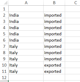
- Check this image: step:1
How to Insert Comments in Excel:
- A comment is used to add additional information related to data or sheets.
Adding Comments in Excel:
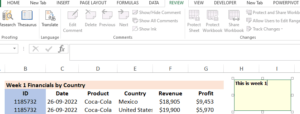
- The cell where you want to add the comment should be selected.
- Select “Insert comment” from the menu by performing a right-click on the cell.
- You can type your message in the comment box that will appear next to the cell.
- Enter the remark or click outside the comment box to save it.
View comments:
- To view the comment, either pick the cell to display the comment in the comment box or hover over the cell to display a small box containing the comment text.
Edit comment:
- From the context menu, choose Edit Comment by right-clicking the cell where the comment is located.
- Modify the comment field’s comment wording.
- To save your changes, click outside the comment box or press Enter.
Formatting Comments:
- Excel gives you the option to format comments to make them easier to read.
- The text can be formatted by changing the font, size, or other formatting choices by right-clicking on the cell containing the comment and choosing “Edit Comment.”
- By hitting Enter or clicking outside the comment box, you can save the formatting changes.
Deleting Comments:
- To delete a comment, perform a right-click on the cell that contains it and select “Delete Comment” from the menu.
- The comment will be removed, and the cell won’t show the related information anymore.
Check below the image:
How to Use Format Painter (clt+shift+c) in Excel
- You may easily apply formatting from one cell or range to another using the helpful feature called Format Painter in Excel. The formatting properties, including font, fill colour, borders, and more, can be copied to save time and effort. An instruction manual for using Excel’s Format Painter is provided below:
- Select the cell or range that contains the formatting you want to copy to get started.
- On the Excel toolbar, look for the Format Painter button. The “Home” tab of the Excel ribbon is where you may find it. A paintbrush icon is typically used to represent it.
- To use Format Painter, click the button. Your cursor will change into an icon for a paintbrush as a result.
- Click and drag your cursor over the cell or range where you want to apply the formatting while the Format Painter is active. When you have selected the required destination range, make sure you release the mouse button.
- The target range will immediately receive the formatting from the source cell or range.
- Double-click the Format Painter button to apply the same formatting to numerous non-adjacent cells or ranges. As long as you don’t manually deactivate it by clicking the Format Painter button or pressing the “Esc” key, the Format Painter will remain active.
- Before choosing the target range, double-click the Format Painter button or hit “Esc” to eliminate the formatting that the Format Painter duplicated. You can make sure that no formatting is used inadvertently by doing this.
- These procedures will allow you to utilize Excel’s Format Painter tool to its best potential. It makes it easier to apply uniform formatting across different cells or ranges, enabling you to easily construct spreadsheets with a polished appearance.
How can Format Painter be used without a mouse by using keyboard shortcuts?
Select the Cell with the Desired Formatting:
- Use the arrow keys on your keyboard to navigate to the cell with the formatting you want to copy. This cell is your “source” cell.
Copy the Formatting:
- Press Ctrl + Shift + C to copy the formatting from the source cell. This keyboard shortcut is equivalent to using the Format Painter.
- Apply Formatting to Other Cells:
- Use the arrow keys to navigate to the cell or range where you want to apply the copied formatting. This cell or range is the “target” cell.
Paste the Formatting:
- Press Ctrl + Shift + V to paste the formatting onto the target cell or range.
- CLT+’
- In Excel, “Ctrl+'” (Control key plus an apostrophe) is a keyboard shortcut used to copy the formula (value) from the cell directly above the currently selected cell. It is a quick way to enter the same data in a cell that is directly above the one you are working in.
- Select the cell where you want to copy the formula value.
- Press Ctrl+’ (Control key and apostrophe key) together.
- The value from the cell above will be copied into the selected cell.
Advantages and disadvantages of Dragging a formula in Excel through Format Painter
Advantages
- Efficiency: It’s a quick way to replicate a formula across a range of cells without the need to manually enter the formula for each cell.
- Consistency: When you have a formula that you want to apply to a series of data, dragging it ensures consistency in calculations.
- Time-saving: For large datasets, dragging saves a significant amount of time compared to manual entry.
- Ease of Use: It’s a straightforward method, making it accessible to users with varying levels of Excel proficiency.
Disadvantages:
- Errors: If the formula is not designed to be dragged (e.g., if it contains absolute references), dragging it might lead to errors in your data.
- Complexity: In more complex worksheets with intricate relationships and dependencies, dragging can introduce issues or require extra care to set up correctly.
- Inflexibility: Dragging is most efficient for straightforward data and formulas. If you need to apply different formulas to cells or adjust them based on specific criteria, dragging may not be the best method.
- Potential Oversights: If you drag a formula over a large range, you might overlook the formula’s logic and not notice if it doesn’t fit the new cells.
- Cell References: Dragging can change cell references in unexpected ways if the formula contains mixed references. You need to understand how relative, absolute, and mixed references work.
- Large Datasets: For very large datasets, dragging formulas can slow down Excel’s performance.
How to Protect cell, Sheet, and workbook in Excel:
- Protecting sheet is hiding data from other users. You can lock the cells on an Excel worksheet and then password-protect it to prevent other users from editing, changing, moving, or deleting data.
- With worksheet security, you may restrict editing to only a few areas of the sheet, preventing users from changing any other sheet data.
Protect Cells in Excel:
- Choose the cell which want to protect > click and dragging the mouse over them.
- Right-click on the selected cell and select >”format cells”.
- In the format cells dialog box go to the > “protection” tab.
- Click the box next to “locked” to lock the chosen cell.
- Changes will save after clicking on ‘OK’. Click “ok” to save the change.
Enabling Cell Protection:
- In the Excel ribbon, select the “Review” tab to enable cell protection. For reviewing and safeguarding your worksheet, you can use the tools and settings found on this tab.
- Find the “Protect Sheet” button in the toolbar under the “Review” tab. To view the settings for sheet protection, click on it.
- You can set a password to limit access to the protected cells if asked to do so. Any subsequent modifications to the protected cells will need this password.
- To secure the cells after setting the password (if desired), click “OK.” Users will now need to enter the password to make any changes because the selected cells are locked and secured.
Protect sheet in Excel:
- The user must enter the password (if set) to make changes to the protected sheet.
- Open the workbook containing the sheet you want to protect in order to protect the full sheet in Excel.
- Right-click the sheet tab in the Excel window’s bottom-left corner. A context menu is displayed.
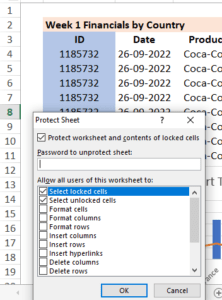
- From the context menu, choose Protect Sheet. This will bring up a dialogue box with options for sheet protection.
- By entering a password in the dialogue box, you can, if you’d like, limit who can view protected sheets. Additionally, you can choose specific options to permit or prohibit particular actions, such as: B. Choose format cells or locked cells.
- To protect the sheet after configuring the required choices, click OK. The limits will be in place, and the sheet will be protected.
- Check below image:

- Select the option to “protect sheet” by clicking right on a sheet. Also available is a choice under the review tab.
Check both images.
How to Unprotect an Excel worksheet
- steps for unprotecting
- Navigate to the worksheet that you want to unlock.
- Go to File > Info > Protect > Unprotect Sheet, or select Unprotect Sheet from the Review tab’s Changes menu.
- Enter the password in the Unprotect Sheet dialogue box if the sheet is password-protected, and then click OK.
What are the Logical Operators in Excel
- SUM: The SUM function calculates the sum of a range of cells. For example: “=SUM (A1:A8)” will give the sum of values in cells A1 to A8.
- IF: The conditional operator known as the IF function returns a value based on a specified condition. If the condition is true, it evaluates it and returns one value; if the condition is false, it returns a different result. For instance, the expression “=IF(B20>10, “Yes”, “False”)” will return “Yes” if the value in cell B20 is more than 10, and “False” otherwise.
- AND: If all of the conditions are met, the AND operator returns true. It simultaneously checks to see if several conditions are met
- OR: If at least one of the predetermined conditions is true, the OR operator returns true. It determines which of the conditions are true.
- NOT: The NOT operator flips a condition’s logical value. If the condition is true, it returns TRUE; otherwise, it returns FALSE. It can be applied to disprove a condition’s outcome.
- = (equal to): The equal to operator determines whether two values are equal to one another. As an illustration, “A1=B1” will return true if the value in cell A1 and cell B1 is equivalent.
- <> (not equal to): The not equal to operator (>) determines
- whether two values are not equal to one another. For instance, “A1>B1” will return true if cell A1’s value is not equal to cell B1’s value.
How to Insert image, shape, or Object in Excel:
Ability to insert images, shapes, and objects to enhance your spreadsheets. Here’s a breakdown of each feature:
- Insert Image: You may quickly insert images into your Excel spreadsheet using the “Insert Image” tool. With this feature, you can choose and insert images from your computer’s desktop or local storage, giving your workbook a visual representation.
- Insert Shapes: You can insert a variety of shapes into your spreadsheet using Excel. These geometrical forms consist of rectangles, circles, arrows, lines, and others. You can focus or highlight particular portions of your data by using these shapes, which will make it look more appealing and organized.
- Insert Object: You can immediately insert objects from other apps into your Excel workbook using the “Insert Object” feature. Word documents, PDF files, movies, PowerPoint presentations, and even other Excel worksheets are examples of the kind of objects you can embed or link. This enables you to include pertinent information from other sources, giving your spreadsheet extensive and interactive information.
- Steps: Go to insert tab> click on text> there are object options and click on that add.
Difference Between Formulas and Functions in Excel
The main difference between formulas and functions in Excel is that formulas are the expressions that perform calculations, manipulate data, or return values, while functions are the built-in tools that perform specific operations on data, such as calculations, lookups, and text manipulations.
Formulas can contain multiple functions, cell references, and operators to perform complex calculations, while functions are pre-built tools that can be used within formulas or on their own to perform specific tasks. Formulas and functions are essential tools for data analysis and calculation in Excel.
What is Formula in Excel?
Excel formulas are expressions that perform calculations, return values, or manipulate data. They are made up of mathematical operators, cell references, and functions, built-in tools that perform specific operations on data.
Formulas can be used to perform various calculations, such as adding numbers, finding the average of a range of values, or checking whether a condition is true or false. They can also be used to manipulate data in various ways, such as concatenating text strings or extracting specific characters from a text string.
What is Functions in Excel?
Excel functions are built-in tools that perform specific operations on data, such as calculating sums, averages, and counts, performing text and date manipulations, looking up and referencing data, and more.
Excel has a vast library of built-in functions, organized into categories such as Math and Trig, Statistical, Text, Date and Time, Lookup and Reference, and more. In addition, users can create their custom functions using Visual Basic for Applications (VBA) programming language.
Excel functions are a powerful tool for performing complex calculations and data analysis, and they can save a lot of time compared to manual calculations.
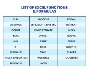
List of Excel Functions & Formulas
Here are some of the most important functions and formulas in Advance Excel:
How to Apply STAT FORMULAS in Excel
In statistics, a formula can perform all statistical work.
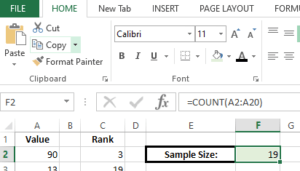
1. COUNT:
- Using the specified range as input, this formula counts the number of chosen cells. It counts the number of cells with values in them and then returns that total.
Formula: =Count (cell_range), =Count(A10:A20)
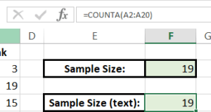
2. COUNTA:
- The COUNTA formula, which excludes empty cells, counts the number of non-blank cells in a range. Every type of data is taken into account, including text, numbers, logical values, and even cells containing formulas or mistakes.
Check See below example:
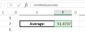
3. AVERAGE:
- The average of a group of cells is determined by the AVERAGE formula. The average value is calculated by adding together all the values in the range and dividing the result by the overall number of cells having numeric values.
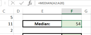
4. Median:
- The median value within a group of cells is determined by the Median formula. It chooses the middle value after placing the values in ascending order. It computes the average of the two middle values if there are an even number of values.
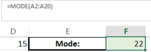
5. MODE:
- The MODE formula finds the value that appears the most frequently among a group of cells. The value that appears in the range the most frequently is found and returned.
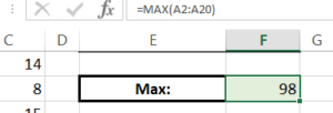
6. MAX:
- The MAX formula returns the cell range’s highest value. The greatest value is chosen as the output after scanning the whole range.
7. MIN:
- The MIN formula returns the cell range’s lowest value. The least value found when searching the range is chosen as the output.
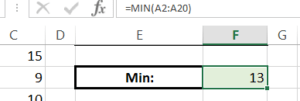
8. 25th Percentile:
- The formula for determining the 25th percentile determines the value below which 25 percent of the data in a range falls. It divides the data into four equal parts, ascends the order of the data, and then chooses the value that lies between the first and second quartiles.
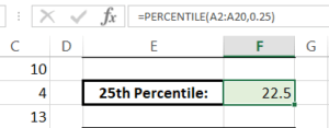
9. STDEV:
- The standard deviation of a sample is calculated using the STDEV formula. It determines how widely distributed the data is by measuring the dispersion or variability of data points from the sample mean.
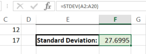
10. Variance(VAR):
- The VAR formula determines a sample’s variance. It provides a measurement of the spread of the data by quantifying the average squared difference between each data point and the sample mean.
11. Nth Largest:
- This formula, you can find the cell range where the value is the Nth largest. The value at the Nth place is chosen after the values are arranged in decreasing order.

12. STDEVP:
- The STDEVP formula determines the population’s overall standard deviation. It provides a measurement of the general distribution of the data by measuring the dispersion or variability of data points from the population mean
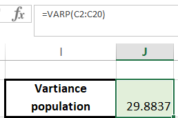
13. VARP:
- The VARP formula calculates a population’s overall variance. It provides a measurement of the spread of the data across the entire population by quantifying the average squared difference between each data point and the population mean.
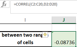
14. CORREL:
- The correlation coefficient between two cell ranges is determined using the CORREL formula. The degree and direction of the linear relationship between the two sets of data are both measured.
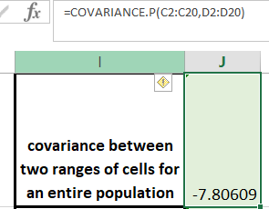
15. COVARIANCE.P:
- The COVARIANCE.P formula determines the covariance of two data sets when seen as a population as a whole. It assesses the population’s overall relationship between changes in one variable and those in another.
16. COVARIANCE.S:
- Using two data sets as a sample, the COVARIANCE.S formula calculates the covariance. Based on a sample of the population, it assesses the relationship between changes in one variable and changes in another variable.
Use Of IFS FUNCTIONS in Excel:
1. SUMIF:
- Add up the values of the cells in a range that satisfy a set of requirements.
![]()
2. COUNTIF:
- This function counts how many cells in a given range satisfy a given condition. view the image below

3. AVERAGEIF:
- Determines the average of cells in a range that satisfy predefined requirements.

4. SUMIFS:
- Determine values for various ranges that satisfy various requirements.
- Counts the number of cells across different ranges that satisfy various criteria.
5. COUNTIFS:
- Counts the number of cells in multiple ranges that meet multiple criteria.
![]()
6. AVERAGEIFS:
- The average of the cells for all ranges that satisfy all requirements.
Use of LOOKUP FUNCTION in Excel
VLOOKUP (Vertical Lookup):
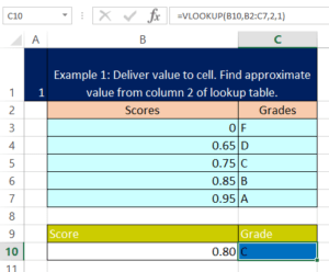
VLOOKUP is a commonly used function in Excel that allows you to look up a value in the leftmost column of a table and retrieve the corresponding value from another column. Here’s how it works:
- Choose the cell where the lookup result should be shown.
- Enter the VLOOKUP formula: =VLOOKUP(lookup_value, table_array, col_index_num, [range_lookup]).
- Replace “lookup_value” with the value you want to search for.
- Specify the “table_array,” the range containing the data you want to search in.
- Indicate the “col_index_num” to determine the column with the desired result.
- Optionally, set the “range_lookup” parameter to TRUE for an approximate match or FALSE for an exact match.
- To retrieve the search result, press Enter.
- Check below example:
HLOOKUP (Horizontal Lookup):
HLOOKUP is a function in Excel that allows you to search for a value in the top row of a table and retrieve the corresponding value from the row below it. Here’s a step-by-step guide on using the HLOOKUP formula:
- Choose the cell in which the lookup result should be displayed.
- Enter the HLOOKUP formula: =HLOOKUP(lookup_value, table_array, row_index_num, [range_lookup]).
- In the top row of the table, swap out “lookup value” with the value you wish to search for.
- You must specify the “table array,” or the set of cells in which the information you wish to search for is located. The top row (which contains the lookup values) and the row behind it have to be included in this range (containing the desired results).
- Indicate the “row_index_num” to determine the row from which you want to retrieve the result. For example, if you want the result from the second row below the top row, you would enter 2.
- If desired, you can set the “range lookup” argument to FALSE for an exact match or TRUE for a close match. If set to TRUE, HLOOKUP will look in the top row for the lookup value that is the closest match. Only exact matches will be found if the value is set to FALSE.
- To retrieve the search result, press Enter.
- Check below image:
XLOOKUP (Advanced Lookup):
XLOOKUP is a more versatile lookup function available in the latest versions of Excel. It can perform both vertical and horizontal searches and also offers additional functionality. Here’s a quick.
- Choose the cell where the lookup result should be shown.
- Enter the XLOOKUP formula: =XLOOKUP(lookup_value, lookup_array, return_array, [if_not_found], [match_mode], [search_mode]).
- Replace “lookup_value” with the value you want to search for.
- Specify the “lookup_array,” the range containing the lookup values.
- Indicate the “return_array,” the range containing the values to be returned.
- Optionally, set the “if_not_found” parameter to define the result when no match is found.
- Adjust the “match_mode” and “search_mode” parameters as needed.
- To retrieve the search result, press Enter.
Check below example:
What is The Use of INDEX MATCH Functions in Excel
INDEX Function in Excel:
- The Index function in Excel retrieves the value of a cell within a specified range based on its row and column numbers. Here’s how to use it:
- Select the cell where you want the result.
- Enter the Index formula: =INDEX(array, row_num, [column_num]).
- The range of cells containing the data you wish to search in is the “array,” therefore define it as that.
- Specify the “row_num” to identify the row within the range.
- Optionally, provide the “column_num” to identify the column within the range (if omitted, the entire row is returned).
- Press Enter to display the result.
- Row_num – is the row number in the array from which to return a value.
- Column_num – is the column number from which to return a value.
- See the below example:
MATCH Function in Excel:
The Match function in Excel helps you find the position of a value within a range. Follow these steps to use it:
- Choose the cell in which the outcome should appear.
- Enter the Match formula: =MATCH(lookup_value, lookup_array, [match_type]).
- You should substitute the value you want to search for for “lookup value.”
- The range of cells in which you wish to conduct the search should be set in the “lookup array.”
- Optionally, define the “match_type” as 0 for an exact match, 1 for a less than match, or -1 for a greater than match (the default is 1).
- Press Enter to display the result.
- Finds a specified value within a range and returns its relative position.
- Check below example:
INDEX MATCH (Combination) Function in Excel:
Combining the Index and Match functions allows you to perform advanced lookups in Excel. Here’s how to use them together:
- Choose the cell in which the outcome should appear.
- Enter the Index and Match formula: =INDEX(array, MATCH(lookup_value, lookup_array, [match_type]), [column_num]).
- The range of cells that contain the data you want to retrieve should be used in place of “array.”
- You can specify the “match type” to narrow down the type of match.
- Optionally, set the “match_type” to refine the type of match.
- To identify the column from which you want to extract data, specify the “column num.”
- Press Enter to display the result.
- See the below example:
Use of Offset Match Function in Excel
The Offset Match function in Excel is a powerful combination that allows you to dynamically retrieve data based on a given reference point. Here’s how to use it step by step.
- Choose the cell in which the outcome should appear.
- Enter the Offset Match formula: =OFFSET(reference, rows, columns, [height], [width]).
- Replace “reference” with the starting cell from which you want to offset.
- Specify the number of “rows” and “columns” you want to move away from the reference cell.
- Optionally, define the “height” and “width” of the resulting range.
- Press Enter to display the result.
The Offset function allows you to specify a reference cell and then move a certain number of rows and columns away from it. It returns the value from the resulting cell or range.
The Match function: The flexibility of this method is further increased when the Match function and Offset are used together. How to combine them is as follows:
- Choose the cell in which the outcome should appear.
- Enter the Offset Match formula: =OFFSET(reference, MATCH(lookup_value, lookup_array, [match_type]), columns, [height], [width]).
- If you want to offset from a cell, replace “reference” with that cell.
- Use the Match function to find the position of the “lookup_value” within the “lookup_array.” cell.
- Indicate how many “rows” and “columns” you want to shift past the reference cell.
- Define the range’s “height” and “width” if you choose.
- To display the answer, hit Enter.
Use Of Text functions in Excel
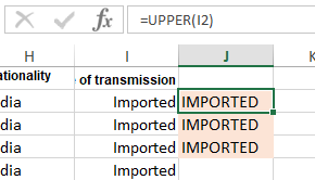
1. Upper Function:
- Gives text to upper case letters.
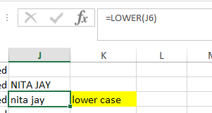
2. Lower Function:
- Convert text to lower letters.
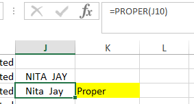
3. Proper Function:
- Converts the first letter of each word to uppercase and the remaining letters to lowercase.
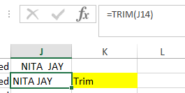
4. Trim Function:
- TRIM function eliminates extra spaces in a text string, including leading and trailing spaces, ensuring clean and well-formatted text.
5. Proper+ Trim Function:
- PROPER+TRIM function trims any leading or trailing spaces from a text string and then capitalizes the first letter of each word, resulting in properly formatted text.
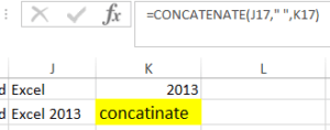
6. Concatenate Function:
- CONCATENATE function allows you to join multiple text strings together, creating a single concatenated string. Simply list the text strings you want to combine within the function.
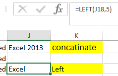
7. LEFT Function:
- LEFT function retrieves a specified number of characters, specified by num_chars, from the left side of a text string. It is useful when you need to extract a portion of a text string starting from the leftmost characters.
8. RIGHT Function:
- RIGHT function retrieves a specified number of characters, specified by num_chars, from the right side of a text string. It is helpful when you need to extract a portion of a text string ending with the rightmost characters.
How to Use Find and Replace Function in Excel
You can locate specific data using Find and Replace features in excel and then replace it with new values. Here is a detailed explanation on how to use them successfully:
Find: Find is identifying specified data.
Steps for find:
- Press Ctrl+F or go to Home > Editing > Find & Select > Find.
- In the Find dialog box, enter the text or value you want to find.
- Click on Find All to display all instances of the search criteria, or click Find Next to locate the next occurrence.
- Excel will highlight the data that has been located, making it simple for you to determine where it is.
Replace: Replace identified information or values with new ones.
Steps for replace:
- To replace text or numbers, press Ctrl+H or go to Home > Editing > Find & Select > Replace.
- Enter the text or value you’re looking for in the “Find what” field of the Replace dialogue box.
- In the “Replace with” field, enter the new value you want to use in place of the old one.
- To replace each instance in the worksheet individually, click Replace, or to replace them all at once, click Replace All
- Excel will execute the replacements and gives a summary of the changes made.
Substitute: Substitute used for replacing specific text with the text string.
Using Date and Time Formulas in Excel
-
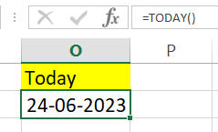
TODAY:
TODAY function in Excel returns the current date. It is a built-in function that requires no arguments and provides the current date based on the system clock.
-
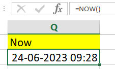
NOW:
The NOW function in excel displays the current date and time in the selected cell.
Creates a date value using the year, month, and day that are provided.
-
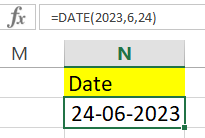
DATE:
DATE function in excel generates a date value by specifying the year, month, and day as separate arguments.
Formula: =DATE(year, month, day)
-
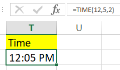
TIME:
Creates a time value based on mentioned hour, minute, and second.
Formula: =TIME(hour, minute, second)
-
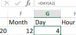
DAY:
Formula: =DAY(date)
The day component of a date is extracted using the DAY function, which then returns the relevant day value.
-
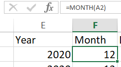
MONTH:
Formula: =MONTH(date)
The MONTH function takes a date and extracts the month component, returning the matching month value.
-
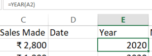
YEAR:
Formula: =YEAR(date)
The YEAR function takes a date and extracts the year component, returning the appropriate year value.
-
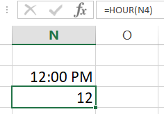
HOUR:
Formula: =HOUR(time)
The HOUR function returns the corresponding hour value after extracting the hour component from a time.
-
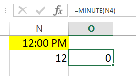
MINUTE:
Formula: =MINUTE(time)
The MINUTE method returns the matching minute value after retrieving the minute component from a time.
-
SECOND:
Formula: =SECOND(time)
The SECOND method returns the relevant second value after retrieving the second component from a time.

-
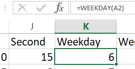
WEEKDAY:
Formula: =WEEKDAY(date)
The WEEKDAY function returns the weekday as a number, with Sunday being 1, Monday denoting 2, and so on.
-
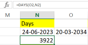
DAYS:
Formula: =DAYS(end_date, start_date)
The DAYS function calculates the number of days that separate two dates, where start date and end date are the earlier and later dates, respectively.
-
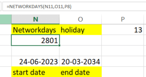
NETWORKDAYS:
Formula: =NETWORKDAYS(start_date, end_date, [holidays])
The NETWORKDAYS function determines the number of working days between two dates, omitting weekends and optionally provided holidays.
-
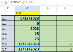
EOMONTH:
Formula: =EOMONTH(start_date, months)
N months before or after the start date supplied, this function returns the last day of the month. Useful for working out due dates or figuring out dates at the end of the month.
-
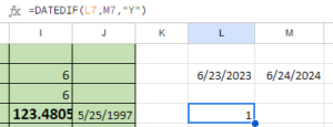
DATEDIF:
Formula: =DATEDIF(start_date, end_date, unit)
Based on the supplied unit, determines the difference between two dates in years, months, or days. useful for keeping track of durations or figuring out age using birthdates.
-
TIME VALUE:
Formula: =TIMEVALUE(time_text)
Converts a textual time into a serial number that represents a fraction of a day. Useful for manipulating time variables in Excel or conducting calculations.
How to Use Nested Formula in Excel
Formula nesting refers to using one formula inside another formula. This allows you to perform multiple calculations or operations within a single cell and to create more complex and dynamic formulas.
For example, you can nest an IF function inside another IF function to create a more complex condition. For example, consider the following formula:
=IF(A2>100, “Greater than 100”, IF(A2<100, “Less than 100”, “Equal to 100”))
This formula uses two IF functions nested inside each other to determine whether the value in cell A2 is greater than, less than, or equal to 100. The first IF function checks whether A2 is greater than 100. The formula returns the text “Greater than 100” if it is. If not, the second IF function is executed, which checks whether A2 is less than 100. Again, the formula returns the text “Less than 100” if it is. If not, the formula returns the text “Equal to 100”.
Another example of formula nesting is using a VLOOKUP function inside an IFERROR function. For example, consider the following formula:
=IFERROR(VLOOKUP(A2, B1:C10, 2, FALSE), “Not Found”)
This formula uses a VLOOKUP function inside an IFERROR function to search for a value in a table and return a specified value if the search fails. For example, the VLOOKUP function searches for the value in cell A2 in the first column of table B1:C10 and returns the value in the second column. The IFERROR function checks for an error in the VLOOKUP function and returns the text “Not Found” if the search fails.
Formula nesting can be used in many ways to create complex and dynamic formulas and perform advanced calculations in Excel. By understanding how to nest formulas, you can unlock the full potential of Excel and streamline your work.
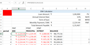
How to Use Financial Formulas in Excel:
- Finance formulas are used to express principles, facts, and laws in finance to represent financial concepts. If you want to determine the potential value of your data or investment, use Excel. You employ these: Here is an example of FV (Rate, Nper, [Pmt], PV, [Type]):
What is Cell Referencing in Excel
Cell referencing in Excel refers to a specific cell or range of cells in a formula or function. Cell references allow you to refer to data in one cell and use it in another cell or cell. This is an important feature in Excel as it enables you to perform calculations and make changes to your data without manually updating each cell.
How to Make Different Types of Cell Reference in Excel
Relative reference: When a formula is copied to another cell, the relative references in Excel are altered.
- Relative referencing in excel is the standard referring style in Excel. A formula or cell reference is automatically adjusted based on its relative position when it is transferred to other cells. A formula like “=A1+B1” in cell C1 will automatically change to “=A2+B2” in cell C2 to retain the relative relationship. When you wish to run the same calculation on various data sets, this style of reference is helpful.
Absolute reference: Absolute references cells constant no matter where they are copied.
- Absolute referencing in excel allows you to lock a mobile reference in a method, stopping it from adjusting when the system is copied or filled to different cells. To create an absolute reference, you operate the dollar signal ($) earlier than the column letter and/or row range. For example, if you want to repair the connection with cellular A1, you’ll use “$A$1” on your formulation. When copied to different cells, the reference will stay the identical.
Mixed Referencing: Relative and absolute referring are used in mixed referencing.
- In Mixed Referencing in excel, you can fix either the column or the row while allowing the other to change. Use the dollar symbol ($) before either the column letter or the row number to create a mixed reference. For instance, “$A1” locks the column but permits adjustment of the row, but “A$1” locks the row but permits adjustment of the column.
Steps to Apply Referencing: To apply referencing in Excel:
- The cell where you want to enter a formula should be selected.
- Begin the formula with an equals sign (=).
- Enter the cell references or values required for your formula.
- Use appropriate referencing types:
- For relative referencing, simply enter the cell references without any dollar signs ($).
- For absolute referencing, use dollar signs before both the column letter and row number ($A$1).
- For mixed referencing, use dollar signs before either the column letter or row number ($A1 or A$1).
Press Enter to calculate the formula result.
How to Use Freezing and Splitting Panes in Excel
With the help of Excel’s two distinct strategies, freezing and splitting, you can more efficiently manage huge datasets and operate with various worksheet portions. An explanation of each follows:
Freezing Panes in Excel:
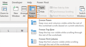
When scrolling across a big spreadsheet in Excel, rows or columns can be frozen to keep them visible. It makes sure that crucial headings or labels are always visible, regardless of where you move within the sheet. Take the following actions to freeze rows or columns:
- Choose the column to the right of where you want to freeze (for freezing columns) or the row below which you want to freeze (for freezing columns).
- Navigate to the Excel ribbon’s “View” tab.
- Select “Freeze Panes” from the menu.
- From the dropdown menu, pick “Freeze Panes” to freeze all columns and rows up to the specified cell, or “Freeze Top Row” to freeze just the row with the headers.
Check this image: Freeze
Splitting Panes in Excel:
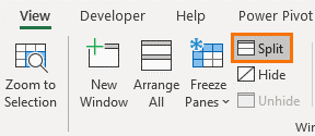
In Excel, you may split a worksheet into multiple panes, each with a separate set of scroll bars. This feature makes it simpler to work with enormous datasets by allowing you to examine various worksheet portions at once. How to divide the worksheet is as follows:
- Set the cursor to the desired bottom-right pane cell, which is normally the top-left area of the worksheet.
- Navigate to the Excel ribbon’s “View” tab.
- Select “Split” from the menu.
- The worksheet will be split into panes, each with its own scroll bars.
- You can adjust the size of the panes by clicking and dragging the splitter bars.
- Simply double-click on the splitter bar to remove the divide.
- Check below the image:
Type of Error in Excel
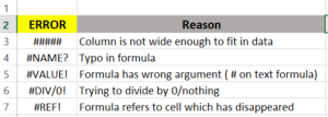
These are common error:
What is Data Validation in Excel?
Data Validation in Excel is a powerful feature that allows you to control the type and range of data entered into cells, ensuring accuracy and consistency. Here’s a unique and plagiarism-free explanation of Data Validation in excel, with simple steps and points:
- Select the cell or range where you want to apply data validation.
- Open the Excel ribbon and select the “Data” tab.
- Select “Data Validation” from the menu.
- Select the limitation type you want to use in the Data Validation dialogue box:
- Whole Number: Allows only whole numbers.
- Decimal: Accepts decimal numbers within a specified range.
- List: Restricts input to values from a predefined list.
- Date: Ensures input falls within a specific date range.
- Text Length: Limits the maximum number of characters allowed.
- Custom: Enables you to create personalized validation rules using formulas.
- Configure the specific settings for your chosen validation type. This may involve setting minimum and maximum values, defining a list of valid entries, or creating
- Various validation types are available: whole numbers, decimals, lists, dates, text lengths, and custom formulas.
- Customize the validation settings to suit your specific requirements.
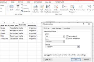
- Check the below example:
Input Message:
- Provide a custom message that shows when a user selects a cell with data validation.
(Instruction), see below image:
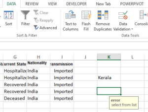
Error Alert:
- Display a warning or error message. When data enters wrong and not allowed entered data.
Data validation in Excel
- Data validation in Excel is a powerful feature that allows you to control and restrict the types of data that can be entered into cells or ranges. This helps prevent errors, maintain data consistency, and ensure accurate information in your spreadsheets.
Creating Data Validation:
- Select the Range: First, select the cell or range of cells where you want to apply data validation.\
Follow these steps Access Data Validation:
- Click on the “Data” tab in the Excel ribbon.
- In the “Data Tools” group, click “Data Validation.”
- Data Validation Dialog Box: The Data Validation dialog box will appear, providing three tabs: “Settings,” “Input Message,” and “Error Alert.”
- Settings Tab:
- On the “Settings” tab, you define the type of data validation you want to apply. Here are the different types:
- Whole Number: Allows only whole numbers to be entered.
- Decimal: Allows only decimal numbers.
- Date: Permits only date entries.
- Time: Restricts input to time values.
- Text Length: Specifies the maximum and minimum text length.
- List: Restricts entries to values from a predefined list.
- Custom: Lets you create your own custom data validation rules.
Custom Data Validation in Excel:
- If you choose “Custom,” you can define your own validation criteria using Excel’s formula-like syntax. For example, you can use formulas like “=AND(A1>10, A1<100)” to ensure a number falls within a specific range.
Input Message Tab:
- The “Input Message” tab allows you to provide a custom message that will pop up when the user selects the cell. This message can be used to provide instructions or additional context about the data that should be entered.
Error Alert Tab:
- The “Error Alert” tab is where you set up an error message that will display if the user tries to enter invalid data. This is helpful for guiding users and preventing data entry mistakes.
- Practical Example – Creating a Drop-Down List:
- To create a drop-down list, select the cell where you want the list to appear and follow these steps:
- Access the Data Validation dialog box.
- In the “Settings” tab, select “List” from the “Allow” drop-down.
- In the “Source” field, specify the range of cells containing the list of values you want to display.
- Click “OK.”
Benefits of Data Validation:
- Data validation ensures data accuracy and integrity.
- It reduces errors caused by incorrect data entry.
- It simplifies data input for users through drop-down lists and input messages.
- Custom data validation rules allow you to implement complex criteria.
- Error alerts guide users when they enter invalid data.
Advanced Data Validation Techniques:
- You can combine data validation rules with Excel functions to create dynamic validation.
- Use named ranges to make data validation rules more manageable.
- Data validation can be applied to entire columns for ongoing data entry control.
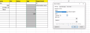

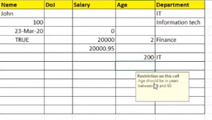
Excel Tables (CTRL+L) Examples
- Excel tables are organized collections of data that offer a number of advantages, including automated sorting and filtering, simple data referencing, and the ability to build dynamic formulas and charts depending on the table’s contents. See the picture below:

- Ranges can be converted into tables and Tables make it easier to structure and organize data.
Table Design Options in Excel
Table design has options and commands:
- Resize
- Remove duplicates
- Convert to Range
- Style options (Total row, Header row, Banded row, etc…)
- Formatting
Table Names In Excel:
The methods below should be followed if you want to modify the table name in the design table.
- Select the table
- Click the Table Design menu
- See the name input field
Table Resizing Options in Excel
- Resize table command
- Drag to resize
- Adding headers

- Removing Duplicate
- Removing duplicates is in design for remove duplicate, cleaning.
- Steps: select data> go to design tab> click to remove duplicate>

How to sort Data in Excel:
You can arrange your data in a certain order depending on one or more columns by sorting data in Excel. This makes it easier for you to study the data, find certain values, or spot trends. To sort data in Excel, take the following actions:
- Sorting in Excel available in the home tab and insert tab sort and filter and after data converted into a table there are also options is available.
- Ranges can be sorted using the Sort Ascendingand Sort Descending
- Sort Ascending: smallest to largest.
- Sort Descending: largest to smallest.
- Custom Sort: To add
- Steps: home tab> select data range> click on sort and filter> click
Basic Data Sorting in Excel:
- Choose the cell range you want to sort.
- Open the Excel ribbon and select the “Data” tab.
- Click the “Sort” button under the “Sort & Filter” group.
- Select the desired column from the “Sort by” dropdown list in the “Sort” dialogue box.
- Choose “A to Z” for ascending order or “Z to A” for descending order to choose the sorting order for the column.
- To sort the data according to your option, click the “OK” button.
Advanced Data Sorting in Excel:
- To add multiple levels of sorting, click the “Add Level” button in the “Sort” dialog box.
- For each additional level, choose the column and sorting order.
- Use the up and down arrows to rearrange the sorting levels based on your preference.
- Click the “OK” button to apply the advanced sorting.
-
Sort by Color:
- Description: Sorts data based on the background color or font color of the cells. Useful for visually categorizing data.
- How to Use: Select the column with colored cells, then click “Sort by Color” under the Sort & Filter button. Choose the desired color criteria.
-
Custom Sort:
- Description: Allows you to create a custom sorting order using a defined list.
- How to Use: Click the “Sort” button, and in the Sort dialog box, select “Custom List.” You can define your custom list to sort data accordingly.
-
Sort by Cell Icon:
- Description: Sorts data based on icons, such as those added with conditional formatting. Useful for prioritizing tasks or data based on icons.
- How to Use: Select the column with icon-based data, then click “Sort by Cell Icon” under the Sort & Filter button. Choose the desired icon criteria.
5. Sort Top to Bottom:
- Description: Sorts data vertically within a column, so the highest value is at the top and the lowest value is at the bottom.
- How to Use: Select the column to sort and click “Sort Top to Bottom” under the Sort & Filter button.
6. Sort Left to Right:
- Description: Sorts data horizontally within a row, so the leftmost value is at the beginning and the rightmost value is at the end.
- How to Use: Select the row to sort and click “Sort Left to Right” under the Sort & Filter button.
7. Quick Data sort

8. Go to data tab à click on sort
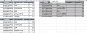
Options and Settings for Sorting Data in Excel:
- Click the “Options” button in the “Sort” dialog box to access additional sorting options.
- In the “Options” dialog box, choose the sorting orientation (by rows or columns).
- Specify whether to sort numbers as text or perform a case-sensitive sort.
- Check the “Sort left to right” option to sort data horizontally.
- Check the “My data has headers” option if your range includes headers.
- Choose whether to sort within hidden or filtered areas of the worksheet.
- Click the “OK” button to save your options.
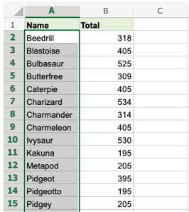
Examples Of Non-working sorting in Excel(Sort one range column)
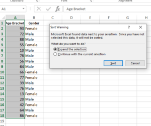
- It is not advised to sort the names by themselves because doing so will destroy the relationship.
- Expand and Sort, the other option in the warning, expands Column B into the sort function and sorts the items in relation to one another.
How to Do Filtering of Data in Excel:
- To display only certain information, filter the data. There are several possibilities accessible throughout the filtering process; after choosing your data, go to the filter option and then choose another option from the home tab:
Different Techniques of filtering Data in Excel :
- Filter by Color: Filter data based on cell color in Excel.
- Filter by Condition: filter specific conditions to filter data in Excel.
- Filter data in Excel to display the top or bottom values using top/bottom filters (ex. top 10, bottom 5).
- Text Filters: Filter data based on text criteria like, contains, does not contain, or begins with.
- Number filters let you sort data in Excel using numerical criteria like greater than, less than, or equal to.
- Date Filters: Filter data based on dates like, before, after, or between certain dates.
- Custom Filters: Create custom filtering criteria using formulas.
- Advanced Filters: Use numerous conditions and complicated criteria to filter data in Excel
- Use the Excel function “Filter by Selection” to sort data according to the contents of a selected cell.
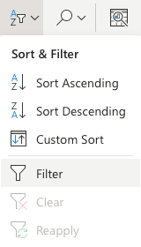
Advanced Filters For data in Excel:
- Go to the “Data” tab in the Excel ribbon.
- In the “Sort & Filter” group, click on the “Advanced” button.
- In the “Advanced Filter” dialog box, choose whether to filter in-place or copy to another location.
- Specify the criteria range that defines the filter conditions.
- Select the range to filter by clicking the “Select a range” button.
- Choose whether to filter the list in place or copy the filtered data to another location.
- Click the “OK” button to apply the advanced filter.
- Using multiple filters:
- You can apply multiple filters to the same data. To do this, select the range of data that you want to filter and then click the Filter button. Next, click the drop-down arrow in the column header of the column that you want to filter and select the values that you want to display. Repeat this process for each column that you want to filter by.
- Clearing filters:
- To clear filters, select the range of data that has been filtered and then click the Filter button. Next, click the Clear button in the Sort & Filter group.
- Here are some additional tips for using filters in Excel:
- You can filter data in a table or range, but not in a PivotTable.
- You can filter data by values, by format, or by criteria.
- You can apply multiple filters to the same data.
- To filter data in a table, select the column header that you want to filter and then click the Filter button.
- To filter data in a range, select the range of data that you want to filter and then click the Filter button.
- To clear filters, select the range of data that has been filtered and then click the Filter button.
- Filtering is a powerful tool that can help you to quickly and easily find the data that you need. By understanding the different filtering options available in Excel, you can make the most of this feature.

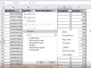
Non-Woking Filtering of Data Examples:
- Apply filters to the new row 1 and be sure to delete row 1 (the header row).
- The header row has been replaced by the filter after application. It is crucial to designate a header row specifically for the filter.
What is Conditional Formatting?
Conditional formatting in Excel is a feature that allows you to apply conditional formatting rules to a range of cells. These rules specify that a certain formatting style should be applied to a cell based on the value in the cell or the value in a related cell.
For example, you might use conditional formatting to highlight cells that contain values above or below a certain threshold or those that contain a specific text string. You might also use conditional formatting to apply specific formatting to cells based on the value of a related cell.
To apply conditional formatting, you first select the range of cells you want to apply the formatting. Then, you click the “Home” tab on the ribbon and select “Conditional Formatting”. From there, you can choose the type of conditional formatting rule you want to apply and specify the rule’s parameters.
How and When to Use Conditional Formatting in Excel:
- Data is filtered using conditional formatting in excel according to the condition.
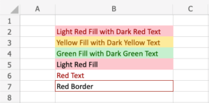
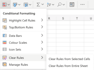
- Rules based on numbers or text are used as conditions. Highlight cell rules, top/bottom rules, data bars, colour scales, icon sets, clear rules, and manage rules are options you can choose from in the image below.
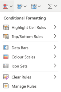
- Highlight cells greater than a certain value: For example, highlight cells in a column with values greater than 100. To do this, you would select the range of cells, select “Conditional Formatting,” then select “Highlight Cells Rules,” and then “Greater Than”. In the “Greater Than” dialog box, you would enter the value 100.
- Highlight cells that contain specific text: For example, you might want to highlight cells that contain the word “urgent”. To do this, you would select the range of cells, select “Conditional Formatting”, then select “Highlight Cells Rules”, and then “Text that Contains”. In the “Text that Contains” dialog box, you would enter the text “urgent”.
- Apply conditional formatting based on the value of a related cell: For example, highlight cells in one column based on the value in a related cell in another column. To do this, you would select the range of cells, select “Conditional Formatting”, then select “New Rule”, and then “Use a formula to determine which cells to format”. In the “Format values where this formula is true” dialog box, you would enter a formula that references the related cell.
- Highlight highest to lowest with color scales:
Check the below example:
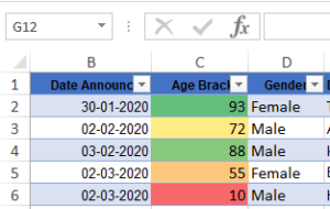
- Highlight cell rules:
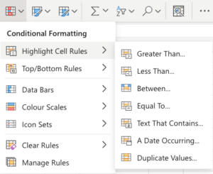
- In this option, there are options for when wanting to data filter greater than, less than, between, as per condition this best way to see data.
Appearance options for Conditional Formatting in Excel
- Dark red writing with a light red fill.
- writing in dark yellow with a yellow fill
- Green till with dark green text
- Light red fill
- Red text
- Red border
Cell type rule in Conditional Formatting
- Greater Than…
- Less Than…
- Between…
- Equal To…
- Text That Contains…
- A Date Occurring…
- Duplicate/Unique Values
Icon Set option
The icon set option is pre-define conditions, there are 4 kinds of icon sets. Icon applies in cells as per the condition. See the below example:
![]()
![]()
![]()
![]()
![]()
Excel Manage rule For Conditional Formatting in Excel:
- Manage rules can manage and clear rules.
- Manage rules can allow to creation rules as per criteria.
- And clear rules use to remove the rule from cells and sheets.
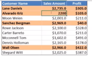
New rules of Conditional Formatting in Excel
- “New Rule” feature in Conditional Formatting allows you to create custom formatting rules to apply to your data.
- Select the Data: Choose the range of cells you want to format based on specific criteria.
- Access Conditional Formatting: Go to the “Home” tab and click on “Conditional Formatting” in the Excel toolbar.
- Choose “New Rule”: In the “Conditional Formatting” dropdown menu, select “New Rule.”
- Define the Rule Type: In the “New Formatting Rule” dialog box, you can choose a rule type. There are options like “Format cells that contain,” “Use a formula to determine which cells to format,” and more.
- Set the Formatting: After selecting a rule type, you can specify the criteria and formatting to be applied when the condition is met. For example, you can set a condition to format cells with values greater than 100 in bold red font.
- Preview and Adjust: Excel provides a preview of how the formatting will appear. You can make adjustments until you’re satisfied with the visual result.
- Apply the Rule: Click “OK” to apply the new rule. The defined formatting will be applied to the selected cells based on the criteria you’ve set.
Types of Charts in Excel for Data Analysis:
Charts are used to visualize data and make it more comprehensible.
The most common charts in Excel are:
- Pie chart
- Column chart
- Line chart
- Bar chart
How to Create these charts:
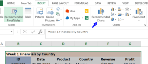
- Select the range.
- Click on the insert
- There are options available for recommended charts choose a chart as per requirement.
Explaining Types Of Excel Charts With Examples:
Excel charts are an effective method for visually organising and displaying data. To design numerous chart types:
Bar Chart in Excel:
- Bar chart used for comparison of one item.
- Bar charts show the data as vertical bars.
- Importance: Bar charts are similar to column charts and are useful for comparing data across different categories.
Steps to Create Bar Chart in Excel:
- Select the data range you want to represent.
- Go to the “Insert” tab and click on the “Column” chart type.
- Excel will insert a column chart, where each column represents a data point.
- Check below example:
Three types of bar charts:
- Stacked bar( )
- 100% stacked bar( )
- Clustered bar( )
Stacked Bar charts:
Compare parts of categories, shows how parts change over time.
- How to Decide When to Use a Bar Chart:
- Use a bar chart when the categories you want to represent are best displayed on the vertical axis (y-axis).
- Consider using a horizontal bar chart when you have long category labels that are easier to read horizontally.
- If you want to compare multiple data series for each category, consider a grouped, stacked, or 100% stacked bar chart depending on your specific data.
Column chart in Excel:
- Column charts show the data as vertical bars.
- Importance: Column charts are ideal for comparing data across different categories, such as sales figures for different products.
- A Column Chart typically displays the categories along the horizontal (category) axis and values along the vertical (value) axis.
Steps to insert Column chart in Excel:
- Select the data range you want to include.
- Go to the “Insert” tab and click on the “Column” chart type.
- Choose the desired subtype to customize the appearance.
Check the below image:
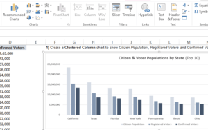
Different types of column charts:
- Clustered column( )
- Stacked column( )
- 100% Stacked column( )
Use of Column chart in Excel
- A Column Chart in Excel is a popular type of chart in Excel that’s widely used to represent data in a vertical, column-based format. It’s a straightforward way to visually represent and compare data across categories or over a period.
How to Create a Column Chart in Excel:
- Data Preparation:
- Organize your data: You should have two columns of data in Excel. One column represents the categories or labels (e.g., months, products, regions), and the other column contains the corresponding values you want to display on the chart.
- Data Selection:
- Select the data: Click and drag your mouse to select the data you want to include in the chart.
- Insert a Column Chart:
- Go to the “Insert” tab on the Excel ribbon.
- In the “Charts” group, click on the “Column Chart” dropdown button. You’ll have various options for column chart types, such as clustered columns, stacked columns, and more.
- Choose the type of column chart that suits your data presentation. For a basic column chart, select “Clustered Column.”
- Customize Your Chart:
- After inserting the chart, you can customize it to your liking. Right-click on various chart elements (e.g., axis labels, legend, data series) to format or edit them.
- You can also adjust the chart title, axis titles, and data labels.
Key Elements of a Column Chart:
- Vertical Bars: In a column chart, each category or data point is represented by a vertical bar. The length of the bar corresponds to the value of the data point.
- Horizontal Axis: The horizontal axis represents the categories or labels. It is also known as the x-axis.
- Vertical Axis: The vertical axis represents the values. It is also known as the y-axis.
- Data Labels: You can choose to display data labels on top of the columns to show the exact values.
Why Use a Column Chart:
- Comparisons: Column charts are excellent for making comparisons between categories or showing changes over time. They allow you to see which categories have higher or lower values.
- Categorical Data: They are ideal for displaying categorical data, such as sales by month, product sales by region, or the performance of students in a class.
- Simplicity: Column charts are simple to understand and create, making them suitable for a wide range of users.
When to Use a Column Chart:
- Comparing Multiple Data Sets: When you want to compare data from multiple categories side by side, use clustered or stacked column charts.
- Showing Trends Over Time: Use a time-series column chart to display trends over a specific period, such as monthly sales figures.
- Highlighting Individual Data Points: Column charts can emphasize individual data points or categories in your dataset.
Column Chart Variations in Excel:
- Clustered Column Chart: Used for comparing data across different categories with grouped columns.
- Stacked Column Chart: Data for each category is stacked on top of each other, showing the total and individual part-to-whole relationships.
- 100% Stacked Column Chart: Similar to the stacked column chart but displays data as percentages, showing each category’s proportion of the whole.
- 3-D Column Chart: A visually appealing option that represents data in three dimensions but can be harder to interpret.

Histogram and Pareto charts in Excel:
Histogram charts in Excel
A histogram chart shows the frequency of values inside various intervals or bins as a visual representation of data distribution. It is an effective technique for examining data distribution patterns. The significance of the histogram chart and how to make one in Excel are described here.
Importance of Histogram charts:
Histogram charts provide insights into the distribution of data, allowing us to identify common values, outliers, and overall data shape. They find applications in statistics, quality control, and data analysis, helping us understand the characteristics of a dataset.
Steps to Create a Histogram Chart:
- Organize your data in a single column in Excel.
- Select the data range you want to include in the histogram.
- Select the “Histogram” chart type from the “Insert” tab.
- Check below image:
- Choose the desired subtype, such as clustered column or stacked column histogram.
- Excel will automatically generate the histogram based on your data. Customize it by adding axis labels, titles, or adjusting the bin size to suit your requirements.
Pareto chart in Excel
To highlight the most important elements in a dataset, a Pareto chart in Excel combines a bar graph and a line graph. Identifying the “critical few” relevant components, it aids in prioritizing efforts. What a Pareto chart is useful for and how to make one in Excel are described below.
Importance of Pareto chart:
By emphasizing the crucial elements that contribute the most to an issue or circumstance, Pareto charts in excel are useful for allocating resources. You can prioritize improvement efforts and make well-informed judgments by concentrating on these elements, which will produce better results.
Steps to Create a Pareto chart:
- Excel should be used to prepare your data, with one column for categories and another for the values associated with each.
- Sort the data in descending order based on the values.
- Calculate the cumulative percentage for each category.
- Select both columns of data, including the categories and cumulative percentages.
- Select the “Combo” chart type from the “Insert” tab.
- Choose the subtype that combines a clustered column with a line graph.
- Excel will generate the Pareto chart. Customize it by adding axis labels, titles, and adjusting the appearance of the bars and line to improve clarity.
Check images:

- Select Pareto from the Histogram drop-down list next to Insert > Insert Statistic Chart.
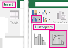
Additionally, you can construct a Pareto chart by selecting Insert > Recommended Charts > All Charts from the menu in Recommended Charts.
Configure Bins
- Select “Format Axis” from the menu when you right-click on the chart’s horizontal axis.
- See this image
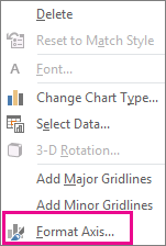
- Use the details below to select the Format options for all bars, colors, and widths that you desire.
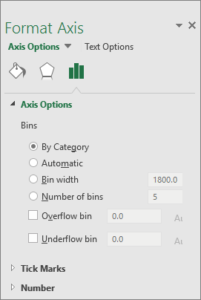
Understanding the Pareto Chart in Excel:
- Bar Chart: A Pareto chart is essentially a bar chart, with bars representing individual categories or factors. These bars are typically arranged in descending order, starting with the most significant factor on the left and descending to the least significant factor on the right.
- Cumulative Percentage Line: A Pareto chart includes a cumulative percentage line, which shows the cumulative percentage of the total as you move from left to right on the chart. This line helps identify the point where a significant portion of the total is reached.
How to Create a Pareto Chart in Excel:
- Data Collection: Collect and organize your data. This data should represent categories or factors that you want to analyze for significance.
- Calculate Frequencies: Count the occurrences or frequencies of each category in your data.
- Calculate Percentages: Calculate the percentage of each category’s frequency in relation to the total. Also, calculate the cumulative percentage as you move down the list.
- Sort Data: Arrange the categories in descending order based on their frequencies or percentages.
Create the Pareto Chart in Excel With Example:
- Select the data (both categories and their frequencies).
- Go to the “Insert” tab in Excel.
- Choose “Bar Chart” from the “Charts” group.
- Select the “Clustered Bar” chart.
- Your Pareto chart is created.
- Customize Your Chart: You can customize the chart title, axis labels, and add data labels for clarity.
Why Use a Pareto Chart in Excel:
- Identifying Priorities: Pareto charts help identify the most significant factors or issues that contribute to a problem or opportunity. By focusing on these factors, you can make targeted improvements.
- Visual Communication: Pareto charts provide a clear and visual representation of data, making it easier for teams to understand and discuss areas for improvement.
- Decision-Making: These charts assist in decision-making by highlighting the areas that have the greatest impact. Teams can allocate resources more effectively based on this information.
When to Use a Pareto Chart in Excel:
- Quality Control: Pareto charts are commonly used in quality control to identify defects or issues that affect product quality.
- Process Improvement: In process improvement initiatives, Pareto charts help prioritize the most significant factors that need attention.
- Cost Reduction: Use Pareto charts to pinpoint cost drivers and allocate resources for cost reduction efforts.
Difference Between Pareto Chart and Other Charts:
- Bar Chart: A typical bar chart displays data without the emphasis on ranking or cumulative percentages. A Pareto chart, on the other hand, specifically arranges data in descending order to prioritize factors.
- Pie Chart: Pie charts display parts of a whole and don’t highlight the ranking or significance of individual categories. Pareto charts provide a clearer indication of significance.
- Line Chart: Line charts show trends over time, while Pareto charts focus on individual categories or factors without a time element.
The 80/20 Rule and Pareto Charts:
- The 80/20 rule, also known as the Pareto Principle, suggests that roughly 80% of the effects come from 20% of the causes. In the context of a Pareto chart, it means that around 20% of the categories or factors are typically responsible for approximately 80% of the issues or occurrences. The Pareto chart helps identify these critical 20% to prioritize improvement efforts effectively.
Note
- Any practical business problem 80 percent of outcome are cause by 20 percent of occurrence
- Why Use the Pareto Chart:
- Resource Allocation: By identifying the most significant factors or issues, organizations can allocate their resources more efficiently to address the areas that will have the greatest impact.
- Effective Problem Solving: Pareto charts assist in targeting specific areas for problem-solving, leading to more effective and focused solutions.
- Continuous Improvement: In quality control and process improvement, the Pareto chart is a valuable tool for ongoing efforts to enhance performance and reduce errors.
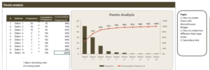
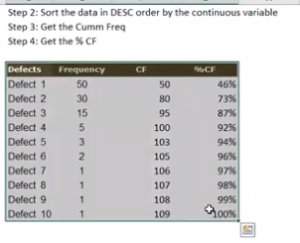
Pie Chart in Excel:
- Pie charts arrange the data as slices in a circle.
Importance of Pie Chart in Excel:
- Pie charts display the proportion of different parts of a whole, such as market share percentages or budget allocations.
- Pie charts display how much each category contributed to the overall amount. Shown as a percentage.
Steps to Create Pie Chart in Excel:
- Select the data range you want to include.
- Select the “Pie” chart type from the “Insert” tab.
- To change the look, select the desired subtype.
Types of pie charts in Excel:
- 2-D pie ( )
- 3-D pie
- Doughnut ( )
Why Use a Pie Chart in Excel:
- Pie charts are used to display parts of a whole, making it easy to see the relationship between each category and the entire dataset.
- They are suitable for showing the composition of a single data series.
When to Use a Pie Chart in Excel:
- Use a pie chart when you want to show how different categories contribute to a total value.
- They are effective for illustrating the distribution of budget allocation, market share, or survey responses.
How to Decide When to Use a Pie Chart in Excel:
- Select a pie chart when you need to convey the relative proportions of different categories within a single dataset.
- Ensure that the categories are mutually exclusive and collectively exhaustive for accurate representation.
Difference Between Pie Chart and Donut Chart in Excel:
- Pie Chart: A pie chart represents data as a circular chart divided into slices, with each slice showing the proportion of a whole. It’s suitable for showing the composition of a single category.
- Donut Chart: A donut chart is similar to a pie chart but has a hole in the center, creating a ring shape. It can be used for similar purposes as a pie chart but offers better use of space and allows for additional data to be displayed in the center.
- The main difference is the presence or absence of a hole in the center. Pie charts have no hole, whereas donut charts have a hole in the middle.
- Donut charts are often used when you want to display multiple data series in a single chart, showing the whole while preserving separate category proportions.
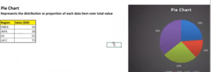
Why Some Companies Discourage Pie Charts:
- While pie charts are a popular visualization tool, they can be less effective when it comes to comparing categories or showing small differences between slices.
- Pie charts can be challenging for some viewers to interpret accurately, especially when there are many small slices, leading to potential misinterpretations.
- Some experts argue that other chart types, such as bar charts or stacked bar charts, are more effective for displaying data accurately.
- Note: A pie chart typically represents a single data series of categorical values in one column. Each category in that column is represented as a slice of the pie, and the size of each slice is proportional to the value it represents within the series. Pie charts are designed to show the distribution of a single set of categorical data.
How to Create a Pie of pie chart in Excel:
- A “Pie of Pie” chart is a variation of a pie chart used to represent categorical data with more detail. It’s especially useful when you have a large number of categories, and you want to highlight some of the smaller categories by breaking them out into a secondary pie chart.
Doughnut Chart in Excel
- Doughnut charts arrange the data as slices in a circle with a hollow centre.
- When there are multiple data columns, doughnut charts are frequently utilized.
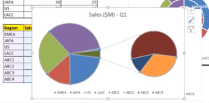
Importance of Doughnut Chart in Excel:
- Doughnut charts, which resemble pie charts but contain a hole in the centre, are significant. They are helpful for displaying percentages with a stronger emphasis on subgroups.
Steps to create Doughnut Chart in Excel:
- Select the data range you want to use.
- Select the “Doughnut” chart type from the “Insert” tab.
- Choose the desired subtype to customize the appearance.
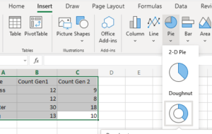
Line Chart in Excel
- Line diagrams can display ongoing data across time. Line charts are frequently employed to display trends over time.
Importance of Line Chart in Excel:
Line charts are helpful for displaying long-term trends or continuous data, such as changes in stock prices or temperature.
Steps to Create Line Chart in Excel:
- Choose a data range that contains a series of data points.
- Select the “Line” chart type under the “Insert” menu.
- Excel will create a line chart, displaying the data points connected by lines.
- In a Line chart −
- Category data in a line chart is dispersed uniformly down the horizontal axis.
- The vertical axis is uniformly dispersed with valuable data.
- Six types of line charts:
- Line charts
- Line charts with Markers
- Stacked Line charts
- Stacked Line with Markers
- 100% Stacked Line charts
- 100% Stacked Line charts with Markers
Why Use a Line Chart in Excel:
- Line charts are used to visualize data that changes continuously over time.
- They are effective for showing trends, identifying patterns, and making comparisons between different data series.
When to Use a Line Chart in Excel:
- Use a line chart when you have data with a time-based or continuous sequence, such as historical stock prices, temperature trends, or sales figures over a period.
- It’s suitable for illustrating changes or trends in data points over a range of values.
How to Decide When to Use a Line Chart in Excel:
- If your data has a time-based component, like dates or intervals, and you want to see trends or patterns, a line chart is a good choice.
- When comparing two or more data series to visualize their relationship or differences, a line chart is preferable.
Difference Between Line Chart and Area Chart in Excel:
- Line Chart: Connects data points with lines, making it easier to see individual values. It’s suitable for showing trends.
- Area Chart: Fills the area below the lines in a line chart with color, creating a visual representation of cumulative values. It’s useful for showing the total or relative contributions of multiple data series over time.
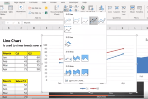
Area Chat in Excel:
- With one exception, an area chart is identical to a line chart in that the space below the line is coloured.
Importance of Area Chat in Excel:
- Area charts, which are frequently used to show cumulative data or stacked numbers, emphasize the extent of change over time.
Steps to Create Area Chat in Excel:
- Select the data range you want to include.
- Select the “Area” chart type from the “Insert” tab.
- Choose the desired subtype to customize the appearance.
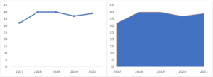
What is an Area Chart in Excel:
- An area chart is a graph that displays quantitative data using filled areas, where the area below each line is color-shaded.
- It’s often used to show the total and relative contributions of multiple data series over time.
How to Create an Area Chart in Excel:
- Select your data in Excel, including the labels for the categories.
- Go to the “Insert” tab in the Excel ribbon.
- Click on “Area Chart.”
- Choose the specific type of area chart, such as a basic area chart, stacked area chart, or 100% stacked area chart.
Why Use an Area Chart in Excel:
- Area charts help visualize and compare the total and relative contributions of multiple data series to a whole over time.
- They are effective for showing trends, highlighting areas of significance, and identifying data overlap.
When to Use an Area Chart in Excel:
- Use an area chart when you have multiple data series that sum up to a whole and you want to show both the individual components and their combined effect.
- It’s suitable for illustrating cumulative data, such as total revenue by product category over time.
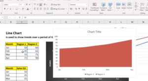
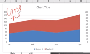
XY scatter chart in Excel
- XY scatter chart, also known as a scatter plot chart, is a type of chart used in Excel to display individual data points on a two-dimensional graph. These data points are typically represented by X and Y coordinates.
Understanding the XY Scatter Chart in Excel:
- X and Y Axes: An XY scatter chart has two axes: the horizontal (X) axis and the vertical (Y) axis. These axes represent numerical values. The X-axis typically represents the independent variable, while the Y-axis represents the dependent variable.
- Data Points: Each data point in an XY scatter chart represents a specific pair of X and Y coordinates. These data points are marked on the chart using markers, such as dots or other symbols. The position of each data point is determined by its X and Y values.
How to Create an XY Scatter Chart in Excel:
- Prepare Your Data: Ensure you have a dataset with two sets of numerical values—one for the X-axis and one for the Y-axis.
- Select Data: Select the data that you want to include in your chart.
- Create Chart: Go to the “Insert” tab in Excel and select “Scatter” from the “Charts” group. Choose the specific type of scatter chart you want to create (e.g., scatter with markers or smooth lines).
- Customize Your Chart: Customize the chart title, axis labels, markers, and other chart elements as needed.
Why Use XY Scatter Charts in excel:
- Visualizing Relationships: XY scatter charts are ideal for visualizing the relationships between two variables. They help you determine if there’s a correlation, trend, or pattern in your data.
- Showing Individual Data Points: Scatter charts are effective at showing individual data points, making them useful for data sets with distinct, separate values.
- Identifying Outliers: You can easily identify outliers or unusual data points on an XY scatter chart, which is valuable for data analysis.
When to Use XY Scatter Charts in Excel:
- Correlation Analysis: Use scatter charts to determine the strength and direction of a correlation between two variables. For example, you might use an XY scatter chart to analyze how temperature affects ice cream sales.
- Trend Analysis: Scatter charts help visualize trends over time. You can use them to track stock prices, sales figures, or other time-series data.
- Comparing Data Points: When you want to compare individual data points in a data set, scatter charts allow you to see variations and outliers.
Difference Between Pie Chart and XY Scatter Chart in Excel:
- Pie Chart: A pie chart is used to show the parts of a whole. It displays categorical data as a circular chart divided into slices, each representing a proportion of the whole.
- XY Scatter Chart: An XY scatter chart displays individual data points as dots (or other markers) on a two-dimensional grid. It represents the relationship between two numerical variables and is used for showing trends, correlations, and outliers.
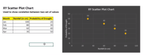
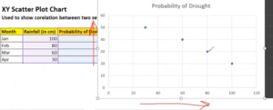
Thermometer chart in Excel
- Creating a thermometer chart in Excel is a visually effective way to track progress toward a goal or target. This type of chart resembles a thermometer, where the “mercury” rises to indicate how close you are to achieving a goal.
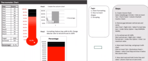
- Step 2: Create the Thermometer Chart
- Select the data in columns A and B.
- Go to the “Insert” tab in the Excel ribbon.
- In the Charts group, click on the “Bar Chart” button.
- Choose “Stacked Bar.”
- A stacked bar chart will be inserted into your worksheet.
- Step 3: Adjust the Chart
- The chart will initially look like a regular stacked bar chart. We need to modify it to resemble a thermometer.
- Right-click on the blue bars (these represent your data).
- Select “Format Data Series.”
- In the Format Data Series pane that appears, set the “Series Overlap” to 100% and the “Gap Width” to 0%. This will make the blue bar completely fill the chart area.
- Your chart should now look like a single, solid blue rectangle, but we still need to format it to resemble a thermometer.
- Step 4: Customize the Chart to Resemble a Thermometer
- Right-click on the chart area (the blue rectangle) and choose “Format Chart Area.”
- In the Format Chart Area pane, set the Fill and Border color as desired for the thermometer body. You can choose a gray or white fill color.
- To add the mercury-like effect, we’ll need to create another data series. You can do this by creating a data range that extends from your current status (e.g., 65) to the maximum value.
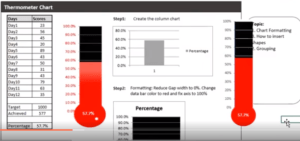
- Final Adjustments
- You may want to add data labels to the “Status” and “Fill” parts to show the current progress.
- Adjust the chart title, labels, and other formatting elements to suit your needs.
Resize and position the chart as necessary within your worksheet
Tree Map Chart in Excel:
- As a visual representation of hierarchical data utilizing layered rectangles, a treemap chart offers a hierarchical view of your data. It enables the unambiguous visualization of data distribution, where different values are represented by varying rectangle sizes and colours. The treemap is described here, along with instructions on how to make one in Excel:
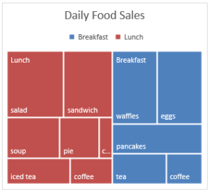
Create a Tree Map chart in Excel
- Select data
- Select Treemap from the Insert tab’s Hierarchy Chart drop-down menu.
- By selecting Insert > Recommended Charts > All Charts, you may also use Recommended Charts to build a tree map chart.
- Change label display
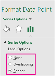
Waterfall chart in Excel
- When items are added or deleted, a waterfall chart updates the running total. It helps to comprehend how a series of positive and negative values effect a starting value (like net revenue).
- Since the columns are color-coded, you can distinguish between positive and negative values with ease. The columns for the initial and end values frequently begin on the horizontal axis, whereas the columns for the intermediate values are floating columns. Waterfall charts are often known as bridge charts because to this “look”.
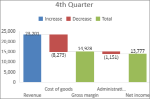
How to Create waterfall chart
- Select data.
- Click Stock chart > waterfall or Insert > Insert waterfall.
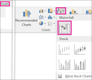
You may also make a waterfall chart using the Recommended Charts’ All Charts menu.
Heat Maps in Excel
- In Excel, a heat map is a visual representation that provides a fast comparison of a dataset.
- For instance, I can quickly identify the months (highlighted in red in the dataset below) where sales were lower than average.
Creating heat map in Excel
- Select the dataset
- Access colour scales by going to Home > Conditional Formatting. It displays different colour schemes that might be employed to highlight the data.
Combo charts in Excel
Excel’s combo chart is a flexible and useful tool for data visualisation that enables users to combine different chart styles into a single graph. With this feature, users can present diverse data sets on a unified platform, enabling comprehensive analysis and observation of patterns, trends, and relationships between variables.
The main objective of utilizing a combo chart is to showcase data with varying scales or measurement units in a cohesive manner.
Steps to Create Combo charts in Excel:
- Decide which data range to use.
- Select the “Combo” chart type from the “Insert” tab.
- To alter the look, select the desired combination of chart types.
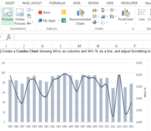
- Combination chart in Excel
- A combination chart in Excel is a chart that combines two or more different chart types to represent data with different scales or categories on a single chart. It allows you to visualize multiple data series with varying units or values in one chart, making it easier to identify trends and relationships between different data points.
Why Use Combination Charts in Excel:
- Combination charts are useful for several reasons:
- They allow you to visualize different data series with varying scales or units on a single chart.
- They help you identify relationships or correlations between data points that might not be obvious when using separate charts.
- They can make complex data more accessible and easier to understand.
- You can highlight specific data points or trends using different chart types within the same chart.
- When to Use Combination Charts:
When You can use combination charts in Excel:
- You want to show multiple data series with different units or scales in a single chart.
- You need to highlight specific data points or trends within your data.
- You want to make your data presentation more efficient and less cluttered.
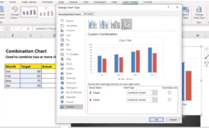
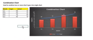
Pyramid chart in Excel
- Creating a pyramid chart in Excel can help you visualize data where values decrease as you move down the pyramid.
- Step 2: Create the Pyramid Chart
- Select the data in columns A, B, and C.
- Go to the “Insert” tab in the Excel ribbon.
- In the Charts group, click on the “Bar Chart” button.
- Choose the “2-D Bar” chart, specifically the “Clustered Bar” option.
- A clustered bar chart will be inserted into your worksheet.
- Step 3: Adjust the Chart
- The chart will initially look like a regular clustered bar chart, so we need to modify it to resemble a pyramid.
- Right-click on the chart, and choose “Select Data.”
- In the “Select Data Source” dialog, click on “Switch Row/Column.” This will rearrange your data to create a pyramid shape.
- Your chart should now resemble a pyramid with the values decreasing from top to bottom, but we still need to format it properly.
- Step 4: Customize the Pyramid Chart
- Click on the data series on the right side of the chart (these are the smaller values).
- Right-click and choose “Format Data Series.”
- In the Format Data Series pane that appears, set the “Overlap” to 100%. This will move the right-side bars to the right edge of the pyramid.
- Set the “Gap Width” to 0%. This will ensure that the right-side bars are adjacent to the left-side bars.
- Set the fill color as desired for the right-side bars.
- Click on the data series on the left side of the chart (these are the larger values).
- Right-click and choose “Format Data Series.”
- Set the “Overlap” to -100%. This will move the left-side bars to the left edge of the pyramid.
- Set the fill color as desired for the left-side bars.
- Remove any unnecessary elements, such as the legend, vertical axis, and any labels not needed for the pyramid chart.
- Step 5: Final Adjustments
- Customize the chart title, labels, and any other formatting elements as per your requirements.
- Resize and position the chart as necessary within your worksheet.

What is the Use of Sparkline
- A Sparkline is a short (within one row) chart that displays data visually in a worksheet cell. Use Sparkline to highlight maximum and minimum values as well as trends in a range of values, such as seasonal rises or declines or economic cycles. For maximum impact, place a Sparkline close to its corresponding data.
Add Sparkline
- Choose the empty cell at the end of the data row.
- Choose the Sparkline type, such as Line or Column, under Insert.
- Select the row’s cells, then click OK.
- More data rows? To add a Sparkline to each row, drag the handle.
Funnel chart in Excel
- Funnel diagrams display values at various phases of a process. A funnel chart, for instance, might be used to display the quantity of sales at each stage of a sales pipeline. Similar to how the values drop off gradually, making the bars look like a funnel.
Steps to create Funnel Chart in Excel:
- Create your data according to the example above. Use a column for the values and another for the process steps.
- Decide on the data.
- Select Waterfall, Funnel, Stock, Surface, or Radar chart by selecting Insert > Insert > Funnel.
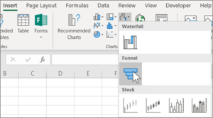
Dumbbell chart in Excel
- A Dumbbell chart is used to help you compare two points in a series that are on the same axis. Also called the DNA chart
Use of Pivot Table in Advance Excel
A pivot table is a highly effective tool available in Microsoft Excel, which helps summarize, sort, and analyze massive amounts of data in a structured and user-friendly manner. It is a dynamic summary table that simplifies complex data by aggregating and organizing it in a meaningful and easy-to-understand format.
Once a pivot table is created, it can be used for multiple purposes like data summarization, filtering, sorting, and creating calculated fields. Pivot tables can help quickly and easily analyze large amounts of data, identify patterns and trends, and present data in a visually appealing and understandable format. In addition, automating calculations and data manipulation can save a considerable amount of time and effort.
For instance, suppose you have a large sales data spreadsheet containing details like the date, product, and region of every sale in a retail store. In that case, a pivot table can help summarize the data and understand trends and sales patterns. For example, using a pivot table, sales can be summarized by region, product, and date by dragging the respective fields to the Rows and Values area.
How to Create Pivot Tables and Pivot Charts in Excel:
- The function to assist organize and analysing data is called PivotTable.
- Pivot Tables in Excel is used for add and remove values, perform calculations, and filter and sort data sets.
- Pivot Table in Excel helps structure and organize data to understand large data sets.
How Pivot tables work in Excel:
Pivot tables in Excel have 4 main components:
- Column
- Rows
- Filter
- Values
- Steps: Select data and click the data tab> then click on the pivot table option. The Table Pivot is displayed.
- The PivotTable Fields panelis used to change how you see the data.
- The settings can be separated into two: Fieldsand Layout.
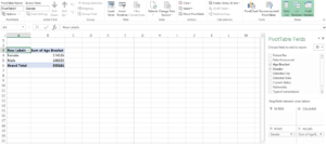
Fields: The checkboxes can be selected or unselected to display or change the data.
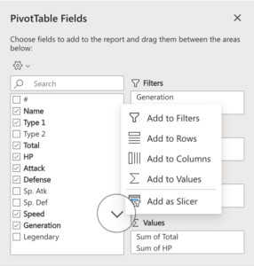
Layout
- To display data in the table, drag fields into the boxes on the right.
- You can drag them to the four different boxes that we mentioned earlier (four main components):
- Filters
- Rows
- Columns
- Values
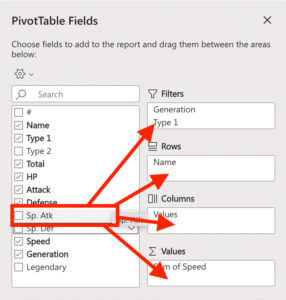
What are Timeliners in Excel?
Time-liners and Slicers are two interactive elements in Excel that filter data in a PivotTable or a PivotChart. They allow you to focus on specific data subsets and improve your dashboards and reports’ overall readability and interactivity.
Timelines
A timeline is a control element in Excel that enables you to filter data based on date and time values. It is a visual representation of a date range that allows you to select a specific time period from a drop-down list or by dragging the timeline to the desired range. Timelines are commonly used with PivotTables and PivotCharts to filter data based on specific dates or time periods, such as months, quarters, or years.
To use a timeline in Excel, you need first to create a PivotTable or PivotChart with a date field. Then, you can add a timeline to your PivotTable or PivotChart by selecting the date field in the PivotTable field list and clicking the “Insert Timeline” button in the “PivotTable Tools” tab.
Here’s a simple example:
Suppose you have a table of sales data that includes a date column. You can create a Pivot Table based on this data and add a timeline to filter the data based on specific dates or time periods. For example, you can select a specific quarter from the timeline and view only the sales data for that quarter.
Pivot table timeline
- Use a timeline as a filter option to quickly filter the date and time instead of altering the filter for dates.
- Click Analysis > Insert Timeline to begin. Look at the picture below.

- Check the desired date fields in the Insert Timeline dialogue box, then click OK.
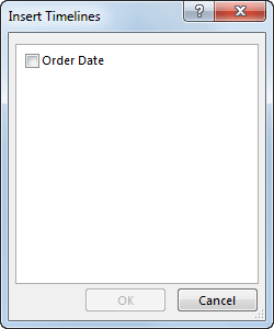
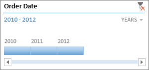
What Are Pivot Tables Used for in Excel?
- Pivot tables are used for data summarization, aggregation, and analysis.
- They help identify trends, patterns, and relationships in data.
- Common use cases include sales analysis, financial reporting, inventory management, and more.
Tips & Tricks for Excel Pivot Tables:
- Use the Right Data Range: Ensure your data range includes all necessary information without empty cells.
- Format Your Data: Properly format your data to avoid issues with data interpretation.
- Choose Field Names Wisely: Use clear and descriptive field names for clarity.
- Apply Pivot Table Filters: Utilize filtering capabilities to focus on specific subsets of data.
- Classify Data: Group data when dealing with large datasets to simplify analysis.
- Customize Layout: Customize the pivot table layout by moving fields to different areas as needed.
- Refresh and Update Data: Regularly refresh the pivot table to include the latest data.
How to Remove Grand Total from a Pivot Table:
- To remove the grand total from a pivot table, select the pivot table, go to the PivotTable Analyze or PivotTable Tools tab, click Field Settings (or Options), and uncheck “Grand Total” or “Show grand totals for rows/columns,” depending on your Excel version.
Grouping Dates in Pivot Tables:
- To group dates in a pivot table, select a cell within the date column, right-click, choose “Group,” and specify the grouping criteria (e.g., days, months, quarters, years).
Adding a Calculated Field in a Pivot Table:
- To add a calculated field, select any cell within the pivot table, go to the PivotTable Analyze or PivotTable Tools tab, click “Fields, Items & Sets,” and select “Calculated Field.” Enter a name and formula.
Copying a Pivot Table:
- To copy a pivot table, select the entire pivot table, right-click, choose “Copy,” go to the destination sheet, right-click, and select “Paste.”
Deleting a Pivot Table:
- To delete a pivot table, select the pivot table, right-click, and choose “Delete” or go to the PivotTable Analyze or PivotTable Tools tab, click “Options” or “Design,” and choose “Delete.”
What are Slicers in Excel?
A Slicer is a visual control element in Excel that allows you to filter data in a PivotTable or PivotChart. Slicers are similar to timelines, but instead of filtering data based on dates, they allow you to filter data based on any field in the Pivot Table. Slicers provide a clear and easy-to-use interface for selecting data subsets, making it simple for users to interact with your dashboards and reports.
To use a Slicer in Excel, you must first create a Pivot Table with one or more fields you want to filter. Then, you can add a Slicer to your PivotTable by selecting the field(s) in the PivotTable field list and clicking the “Insert Slicer” button in the “PivotTable Tools” tab.
Here’s a simple example:
Suppose you have a table of sales data that includes a region field. You can create a PivotTable based on this data and add a Slicer to filter the data based on the region field. For example, you can select a specific region from the Slicer and view only the sales data for that region.
Slicer in Excel Pivot Tables
- How to use slicers in Excel Pivot Tables. Slicers are a user-friendly feature that allows you to filter your data interactively.
Inserting a Slicer in Excel Pivot Table:
- Select any cell within the Pivot Table.
- Go to the “Insert” tab.
- Click “Slicer” in the “Filter” group.
- In the Insert Slicers dialog box, select the dimension(s) you want to filter by.
- Click “OK” to insert the slicer(s) into your worksheet.
Using Slicers in a Pivot Table:
- Once inserted, a slicer provides a visual way to filter your Pivot Table data.
- Click on an item in the slicer to filter your data by that item.
- Hold the “Ctrl” key to select multiple items simultaneously.
- To clear the selection, click the filter icon with a red cross at the top right of the slicer.
Inserting Multiple Slicers in a Pivot Table:
- You can insert multiple slicers by selecting more than one dimension in the Insert Slicers dialog box.
- These slicers are linked to each other, allowing you to apply multiple filters simultaneously.
Slicers vs. Report Filters in Pivot Table:
- Slicers are a more visual way of filtering data and are user-friendly.
- Slicers don’t occupy a fixed cell in the worksheet and can be linked to multiple Pivot Tables.
- Report filters are cell-based and may be more suitable for automation using VBA.
Formatting the Slicer:
- You can customize the appearance of slicers, including modifying colors, arranging items in multiple columns, changing the header, and sorting items.
Hiding Items with No Data:
- You can choose to hide items in the slicer that have no data associated with them.
Connecting a Slicer to Multiple Pivot Tables:
- A slicer can be connected to multiple Pivot Tables that share the same Pivot Cache.
- To connect Pivot Tables to a slicer, right-click on the slicer, go to Report Connections, and select the Pivot Tables you want to connect.
Creating Dynamic Pivot Charts Using Slicers:
- You can use slicers with Pivot Charts to create dynamic, interactive charts.
- Select the data, insert a Pivot Chart, and insert a slicer dimension to filter the chart interactively.
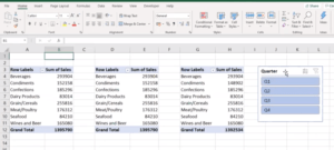
Work with link in excel (Hyperlink)- (FILE, WEB):
Excel’s hyperlink feature is useful for making clickable links that take users to other files or websites.
Creating a Hyperlink to a File in Excel:
- In the “Insert Hyperlink” dialog box, pick “Existing File or Web Page” on the left side.
- Select the text or cell that you want to include the hyperlink in.
- Choose “Hyperlink” from the context menu by performing a right-click.
- Select “Existing File or Web Page” from the left-hand menu in the “Insert Hyperlink” dialogue box.
- Browse for and locate the desired file you wish to link.
Creating a Hyperlink to a Web Page:
- Choose the text or cell that will contain the hyperlink.
- Select “hyperlink” from the context menu by performing a right-click.
- Click the “Existing File or Web Page” option on the left side of the “Insert Hyperlink” dialogue box.
- In the “Address” area, type the URL of the website you want to link to.
- To create the hyperlink, click “OK.”
- A clickable link that leads to the chosen web page will be created from the selected cell or text.
Editing or Removing a Hyperlink in Excel:
- Choose the text or cell that contains the hyperlink.
- Choose “Hyperlink” from the context menu when performing a right-click.
- Change the link URL or text display as needed in the “Edit Hyperlink” dialogue box.
- Click “Remove Link” in the dialogue window to get rid of the hyperlink.
How to Create Dashboard in Excel with Example:
- Step 1: Define the Purpose and Audience
- Before you start building a dashboard, it’s essential to understand its purpose and the intended audience. What insights or information do you want to convey? Who will be using the dashboard? This knowledge will guide your design and content decisions.
- Step 2: Gather and Organize Data
- Collect and organize the data you want to include in the dashboard. Ensure that your data is clean, up-to-date, and relevant to the dashboard’s purpose. You may need to use Excel functions or external data sources to maintain accurate data.
- Data
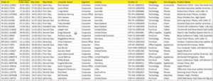
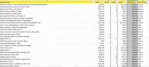
- Understand data
- Step 3: Plan the Layout
- Plan the layout of your dashboard. Decide how many elements (charts, tables, etc.) you want to include and where they should be placed. You can use Excel’s grid to structure your dashboard. Sketch a rough layout on paper or digitally to visualize your design.
- Step 4: Create Visual Elements
- Design the charts, tables, and visual elements that will display your data. Excel offers various chart types (e.g., column, bar, pie, line, etc.) and design options to choose from. Select the types that best represent your data and fit the dashboard’s style.
- Step 5: Insert Charts and Tables
- First take dynamic named range
- Now, insert the charts and tables into your Excel worksheet. To do this:
- Select the data you want to use.
- Go to the “Insert” tab.
- Choose the chart or table type that suits your data.
- Customize the elements like titles, labels, and colors to improve clarity.
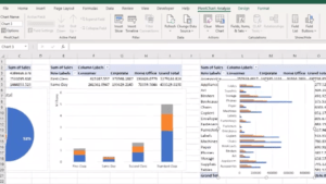
- Step 6: Use PivotTables and PivotCharts
- PivotTables and PivotCharts are powerful tools for summarizing and analyzing data. You can create PivotTables from your dataset and PivotCharts (charts based on PivotTables) to provide dynamic summaries. These elements can be used in your dashboard.
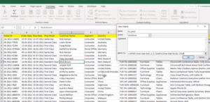
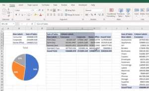

- Step 7: Add Interactivity
- To make your dashboard user-friendly, add interactive elements. Consider using slicers, buttons, or drop-down lists to allow users to filter and explore the data. These elements can help create a dynamic experience.
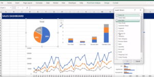
- Step 8: Create a Summary or Title
- Include a clear summary or title at the top of your dashboard. This should provide context and convey the dashboard’s purpose. You can format this using Excel’s text formatting options.
- Step 9: Format and Style
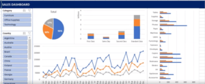
- Apply consistent formatting and style to all elements of your dashboard to ensure a cohesive look. Use themes, colors, fonts, and cell styles to make your dashboard visually appealing and professional.
- Step 10: Review and Test
- Before finalizing your dashboard, thoroughly review and test it. Make sure that the data is accurate, elements are correctly linked, and interactive features work as intended. Check for any errors or inconsistencies.
- Step 11: Protect and Share
- If necessary, protect your dashboard by locking specific cells or sheets to prevent accidental changes. Then, save or share your Excel file with others. You can save it as a regular Excel workbook or use Excel Online to collaborate with others in real-time.
- Step 12: Maintain and Update
- Keep your dashboard up to date by regularly updating the underlying data. You may need to modify charts, tables, or calculations if the data structure changes. Review user feedback and make improvements as needed.
Here’s a simple example of creating a dashboard in Excel:
- Open a new or existing workbook in Excel.
- Choose where you want to place your dashboard and create a new worksheet.
- Create a pie chart representing the data you want to display in your dashboard.
- Format the pie chart to make it visually appealing and easy to read.
- Add a title and labels to the pie chart to provide context for your data.
- Save your dashboard.
You may also like to read: 5 Tips to Learn Advanced Excel
What is VBA and Macros in Excel
- VBA the programming language used by Microsoft is called Visual Basic for Applications.
- Products like PowerPoint, Word, and Excel. It will carry out all of the VBE programming that we intend to accomplish (Visual Basic Editor).
- A VBA Macro is a piece of code that tells Excel how to carry out a certain activity. You can run the same task in the worksheet at any time after writing the VBA code once. The procedure can be automated and repeated, tedious jobs removed thanks to the macro code.
- We can create custom Excel task codes in VBA. You must first record a macro in order to begin coding VBA in Excel.
Excel Macros:
- A series of actions that have been recorded and can be played again repeatedly in Excel are known as macros. It saves time and effort by doing away with the requirement for manual execution. The Macro Recorder or VBA code can be used to build macros.
VBA and macros steps:
- First Developer tab enabled:
- Access the file menu.
- Navigate to the option under file.
- choosing a customised ribbon
Check the below image:
Record Macros: Automate Repetitive Task
- Developer tab, click on Record Macro.

- Give the Macro a proper name.
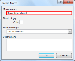
- Your operations are continuously being recorded by the macro recorder in the Excel sheet.
- Under the “Developer” tab, stop recording.
Edit and enhance the macro:
- You can edit the recorded macro in the VBE or add new code to alter its functionality.
- Create more complex macros by using VBA programming principles like variables, loops, conditions, and functions.
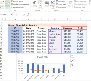
- Select “Visual Basic” from the “Developer” menu. Select and execute saved macro

- When you select “Visual Basic,” the window shown below will appear.
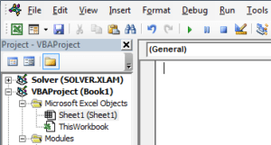
- Click “Modules” twice.
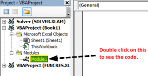
- The code is now visible on the right-hand side.
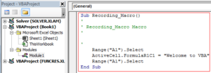
- SUB is the first letter of the macro code.
- Because every macro has a name, they all have two parts: the “Head” and the “Tail.”
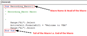
Saving Macros
- Macros are saved
- The Excel workbook with the macro code is saved as a “Macro-Enabled Workbook.” Then, select “Save As” and “Macro-Enabled Workbook” as the file extension.

Excel macros offer various options and functionalities, including:
- Adding macros to buttons or shapes: Excel users can add macros to custom buttons or shapes they build. This makes it possible for certain macros to be executed quickly and conveniently.
- Macros can be run in response to specific events, such as the opening or closing of a workbook, a change in the value of a particular cell, or the selection of a certain worksheet.
- Making changes to macros: The VBA Editor offers a complete environment for making changes to macros. Users can improve the usefulness of their macros by including conditional statements, loops, variables, and error handling.
- Macros can be shared and distributed by either saving them in a personal macro worksheet or by copying and pasting the VBA code into other workbooks. Multiple users will benefit from the time savings and consistency that are ensured.
- Users can change the security settings in Excel to enable or disallow macros in workbooks. This guarantees the safe execution of macros and stops the execution of potentially dangerous macros from unidentified sources.
What is Power Query in Advance Excel?
Power Query is a data connection and data transformation tool in Microsoft Excel that helps users import, clean, and manipulate data from various sources. It is an add-in for Excel 2010 and later versions and is also included in the Data tab of the ribbon in later versions of Excel.
Power Query makes it easy to import data from a wide range of sources, including databases, spreadsheets, web services, and text files. It also provides a range of tools for cleaning and transforming data to make it easier to work with. This includes removing duplicates, merging, splitting, and converting data types.
Once data has been imported into Power Query, it can be transformed and manipulated using the user-friendly graphical interface. Power Query also provides a range of advanced functions for transforming data, including grouping and aggregating data, pivoting data, and using complex expressions to create calculated columns.
What is Data Modeling in Advanced Excel?
Data modeling in advanced Excel is the process of creating a structured representation of data to understand and analyze it better. This typically involves creating relationships between different data elements and organizing the data into a format that makes it easier to analyze.
Data modeling aims to create a simplified and intuitive representation of data that can be used to gain insights and make decisions. Some common techniques used in data modeling include creating spreadsheets, building data relationships, creating calculated fields, and creating pivot tables
One example of data modeling in Excel is creating a budget model. A budget model is a spreadsheet that includes all the financial data for a company or organization, such as revenue, expenses, and cash flow. The data is organized in a structured format, and relationships between different data elements are established. This allows for easy data analysis and helps identify areas where the budget is over or under budget.
Excel data modeling can also be used to analyze customer data, such as sales data, customer demographics, and customer behavior. By creating relationships between these data elements and organizing the data into a structured format, it becomes possible to gain insights into customer behavior and make informed decisions about marketing and sales strategies.
What-if Analysis in Excel
Advanced Excel offers a helpful What-if analysis feature, which allows users to manipulate values in a spreadsheet and observe the impact of those changes on other cells in the workbook. This feature enables users to test different scenarios and make informed decisions based on the outcomes.
Several methods are available to perform What-if analysis in Excel, including data tables, scenarios, and Solver.
You may also like to read: A Quick Guide to Excel in Data Analytics
Data Tables
Data tables are ranges of cells that display the results of substituting different values in a formula, and they can be used for one-variable or two-variable What-if analysis. For instance, one can use a data table to analyze the effect of varying interest rates on the future value of an investment. Creating a one-variable data table involves formulating a calculation for the future value of the investment and constructing a table that substitutes different interest rate values.
Scenarios
Scenarios refer to sets of saved values used for What-if analysis. These scenarios can be created by altering cell values, creating formulas, or adding charts. For example, one could create a scenario that demonstrates the impact of diverse sales projections on a company’s net income by adjusting the sales projection values, saving the scenario for future reference.
Solver
Solver is another useful tool that performs What-if analysis by changing cell values to find the values that produce the desired outcomes. It can help solve complex problems by finding optimal solutions by changing cell values in a spreadsheet. For example, one could utilize Solver to optimize a production schedule by determining the number of daily units that minimize production costs. To utilize Solver, one must first create a production schedule as a spreadsheet, specify the constraints, and then use Solver to find the optimal solution.
Goal Seek in Ms Excel
Goal Seek is a tool in advanced Excel that allows users to find the input value that produces a specific result in a formula. For example, financial modeling often uses goal seeking to determine the value of an unknown input that results in a desired outcome.
For example, let’s say you have a loan payment formula in Excel that calculates the monthly payment amount based on the loan amount, interest rate, and loan term. If you know the monthly payment amount you can afford, you can use Goal Seek to determine the loan amount resulting in that monthly payment.
Here’s how you would use Goal Seek to solve this problem:
- Enter the loan payment formula into a cell in the spreadsheet.
- Enter the known values for interest rate and loan term into the formula.
- Select the cell that contains the formula and go to the “Data” tab in the ribbon.
- Click on “What-If Analysis” and then select “Goal Seek”.
- In the “Set cell” field, enter the cell that contains the formula.
- Enter the desired monthly payment amount in the “To value” field.
- In the “By changing cell” field, enter the cell that contains the loan amount.
- Click OK.
Goal Seek will then solve the formula and determine the loan amount resulting in the desired monthly payment amount. Finally, the solution will be displayed in the loan amount cell.
How to Import Data From Other Sources in Excel?
You can import data from other sources in Excel using the following steps:
- Open a new or existing Excel workbook.
- Click on the “Data” tab in the ribbon at the top of the screen.
- In the “Get & Transform Data” section, click on the “From Other Sources” dropdown menu.
- Select the type of data source you want to import, such as “From Text/CSV”, “From Web”, “From Microsoft Access”, or “From SQL Server”.
- Follow the prompts and fill in the necessary information to connect to your data sources, such as the file path or web URL, database server name, or login credentials.
- Preview and select the data you want to import from the data source.
- Choose to import the data to a new worksheet, a specific location in the current worksheet, or a new workbook.
- Click “Load” to import the data into Excel.
Note that the specific steps may vary depending on the type of data source you are importing from. Excel provides many options for transforming and cleaning up imported data, such as splitting columns, filtering rows, and merging tables.
A List Of Excel Shortcut Keys:
- Ctrl+N = New Workbook Create
- Ctrl+O = Open workbook
- Ctrl+S = Save the workbook
- Ctrl+f4 = Close Excel
- Alt+H = Work with all home tab.
- Ctrl+c and Ctrl+v = stand for copy and paste.
- Ctrl + B: Apply bold formatting to selected cells or text.
- Ctrl + I: Apply italic formatting to selected cells or text.
- Ctrl + U: Apply underline formatting to selected cells or text.
- Ctrl + P: Open the Print dialog box to print the workbook.
- Ctrl + A: Select the entire worksheet or data range.
- Ctrl + F: To search for specific data, use the Find dialogue box.
- Ctrl + H: To find and replace data, use the Replace dialogue box
- Ctrl + K: Insert a hyperlink in the selected cell or text.
- Ctrl + N: Create a new Excel workbook.
- Ctrl + O: Open an existing Excel workbook.
- Ctrl + W: Close the active workbook.
- Ctrl + Tab: Switch between open workbooks or worksheets.
- Ctrl + Shift + Arrow keys: Select a range of cells based on the direction of the arrow keys.
- Ctrl + Shift + L: Apply a filter to the selected range.
- Ctrl + Shift + P: Insert a page break in the worksheet for printing.
- Ctrl + Shift + F: Open the Format Cells dialog box.
- Ctrl + Z: Go back to the previous state or undo the most recent action.
- Ctrl + Y: Undo the previous action.
- Ctrl + X: Cut text or selected cells.
- Ctrl + D : Fill down with. copies the contents of the selected cells below from the cell above.
- Ctrl + R : Fill right. copies the contents of the selected cells on the right from the cell to the left.
- Ctrl + G: To swiftly browse to a particular cell or range.
- Flash fill: Ctrl + E. Values are filled automatically based on a pattern that Excel has found.
- Insert cells, rows, or columns with Ctrl + numpad Plus (+).
- Cells, rows, or columns can be deleted with Ctrl + numpad Minus (-).
- Ctrl + 1 will open the Format Cells dialogue box, letting you to customize the formatting for the chosen cells.
These keyboard shortcuts can save you time and improve your efficiency in Excel. It’s a good idea to learn and memorize the ones you use frequently.
Linear Regression in Excel
Linear regression is a statistical method used to find the linear relationship between two variables. You can perform a linear regression analysis using the LINEST function in Excel. Here’s how:
- Prepare the data: You need at least two columns of data. The first column should be the independent variable (x-axis), and the second should be the dependent variable (y-axis).
- Select a blank cell: Select a blank cell where you want to display the regression results.
- Enter the LINEST function: Type the following formula in the selected cell: =LINEST(known_y’s, [known_x’s], const, stats). The known_y’s argument is the range of cells that contain the dependent variable, the known_x’s argument is the range of cells that contain the independent variable, and the const argument should be set to TRUE if you want the regression line to include a constant term. The stats argument should be TRUE if you want the regression statistics to be displayed.
- Press Enter: The LINEST function will return an array of values representing the regression coefficients, including the slope and the intercept.
- Display the regression line: To display the regression line on a scatter plot, create a scatter plot of your data and add a trendline to the chart. In the Format Trendline dialog box, select the “Linear” option.
- Interpret the results: The slope of the regression line represents the change in the dependent variable for every unit change in the independent variable. The regression line intercept represents the dependent variable’s value when the independent variable is zero. The R-squared value measures the goodness of fit of the regression line. A higher R-squared value indicates a better fit of the regression line to the data.
Conclusion
Advanced Excel is an essential tool for analytics that provides a wide range of powerful features and functionalities to organize, analyze and visualize data. With its ability to handle large amounts of data, perform complex calculations, and create detailed reports and charts, Excel is the go-to software for many professionals in various industries.
By mastering advanced Excel skills, individuals can enhance their data analysis and modeling abilities, allowing them to make informed business decisions, identify trends, and provide valuable insights. As a result, these skills are highly sought after in today’s job market, as many organizations rely on data-driven decision-making to achieve success.
Overall, advanced Excel for analytics is a crucial skill for anyone interested in data analysis, business intelligence, or financial modeling. Its versatility, ease of use, and wide availability make it a valuable tool for businesses and individuals looking to gain a competitive edge in their field.


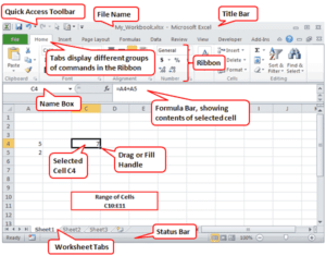
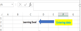
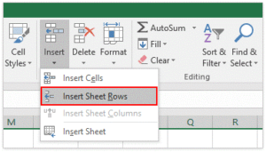

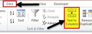
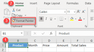
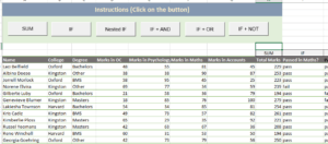
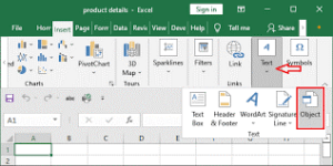
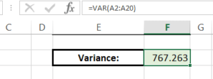
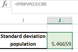
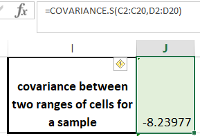


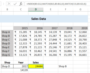
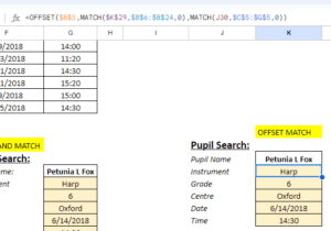
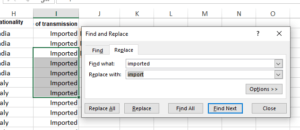
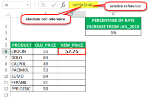


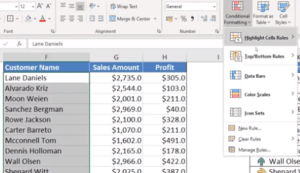
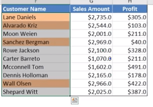
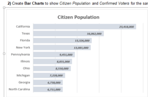
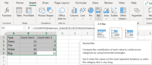
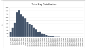
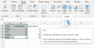
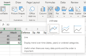
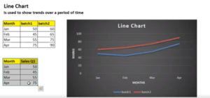
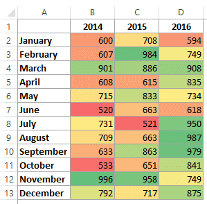
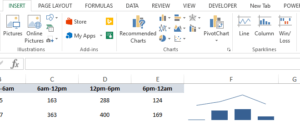
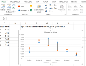
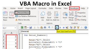
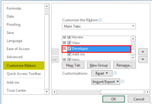

Very informative blog covering one the most needed resource at this point of time.
Targeted, simple and easy to digest! Loved it!
Quite informative, easy to learn and insightful.
Detailed explanation of Excel and easy to grab the concepts.