Introduction
To create an effective and intuitive data visualization, you should first understand human cognition and perception. These processes make us understand the world and the data that make up our lives. For example, the human visual processing is highly efficient at detecting changes, comparing shapes, and determining light-ness variations. It is estimated that about two-thirds of our brains are dedicated to visual processing. The right data visualization can help you see potential connections and relationships between various types of data.
When choosing an effective interactive data visualization, it is important to keep the following in mind:
- What do you want to communicate?
- How much data do you need to work with?
- How you’ll be presenting it?
For example, if you’re displaying data on a time series, you should use a scatter plot to represent the relationship between variables. You should avoid adding too much data, as this can confuse your audience.
Interactive visualizations make it easy to explore and interact with the data. This allows viewers to manipulate the plot elements and make more informed decisions. They also allow organizations to diversify their data displays, leading to deeper understanding and a more detailed analysis. Interactive visualizations can also lead to surprising results! They can help organizations take action on information more efficiently and profitably. They also give employees and managers an easy way to share and discuss ideas with colleagues and other employees.
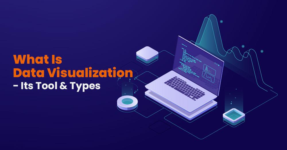
What Is Data Visualization?
The graphical representation of data and information is data visualization. It is like a practice that converts the information into visual representation( maps or charts). Understand the data easily. The aim of data visualization is that the big data is categorized and identified into patterns, outliers, and trends.
The Data Visualization is done to conclude the collected, modeled, and processed data. It is one of the steps in data science. The popularity of data analytics and big data has made data visualization even more popular. Companies are getting more and more data, and making the data understandable through data visualization is essential. It speed up the process for the stakeholders and business owner so that they can understand the data more efficiently.
The information could be quickly practical and universally understandable. It does that part. So some of the advantages of data visualization are-
- The capacity to consume information fast, quick decisions, and upgraded insights.
- Effortless circulation of information maximizes the chance to share insights with everyone.
- To improve the organization, there is a boost in understanding the information for the next steps.
- Remove the want of data scientists as the data is more available and recognizable.
- The ability to maintain the audience’s interest as the data visualization makes the data accessible and understandable.
- The maximized capability to find them quickly and at maximum speed lessened mistakes.
Data visualization Tools
Data visualization tools give the data a direct method to visualize the data universally understandable. The DV tools are for understanding and making the data understandable and more accessible for the audience. There are several types of data visualization tools. Some of them are mentioned below-
Tableau
Tableau is one of the most popular data visualization tools for businesses. A tableau’s quality is that it is the basis of everything. Tableau has revolutionized over time. Tableau makes the information visible and understandable. Could just do this by joining the information and product sources. It can visualize the data for large companies with large and abundant data. Which is continuously evolving the datasets.It is used in machine learning, artificial intelligence, and the application of big data. Let’s look at some of the pros and cons of Tableau-
Pros
- Best visualization services
- Effortless usage
- Supports connectivity with various data sources
- Mobile receptive
Cons
- High prices
- Auto refresh option unavailable.
Google charts
One of the most widely used and popular data visualization tools is google charts. They are with HTML.5, and SVG. the speculation of this tool is the production of graphical representation and pictorial Visualization. It offers the function of zoom as well. The pros and cons of google charts are-
Pros
- User beneficial platform
- Easy usage
- Compatible with products google
- The data graphs are visually attractive
Cons
- Faulty demos
- Lacks customization abilities
- For data visualization, there needs to be network connectivity
IBM
The founder of IBM was Thomas J Watson. The analytical components and artificial intelligence is used for insights and patterns. The Visualization of data from unstructured and structured data. The best thing about IBM is its self-service which guides the user about the insight discovery operation. The pros and cons of IBM are-
Pros
- Natural language processing capabilities
- Self-service
- Anticipating analytics
- Accessibility from various devices
Cons
- High maintenance cost
- Lacks customer care support
Data wrapper
The data visualization tool is free of cost. A few tools provide free-of-cost services. It is famous because of the excellent quality of charts and graphs on big data. It has a simple and wise interface. The data wrapper grants the user to make the maps and charts and then effortlessly insert them into the data reports.
Some of the pros and cons of data wrapper are –
Pros
- Best for beginners
- Free of cost
- The installation of chart creation is not required.
Cons
- Less secure
- Problems in creating complex charts.
PowerBI
An easy-to-use data visualization tool accessible for on-premise cloud infrastructure installation and distribution. This tool is one of the complete tools supporting all types of databases. It creates impressive Visualization and fast decision-making with real-time insights. Let us look at the pros and cons of PowerBI –
Pros
- Highly secured
- does not need specialized technical support
- Personalized dashboard
- No memory and speed restraint
- Goes well with Microsoft products
Cons
- Cannot work with several databases.
Interactive Data Visualization
The goal of Interactive Data Visualization is to present the data in graphic form. Interactive DV aims to grab the attention of the user. The basis of the Interactive DV is like the input inserted and gives quick outputs like action and immediate reaction. Some of the features of interactive data visualization are –
- Reduce and filter out the specific data for Visualization
- Moves one Visualization to another
- You can zoom the specific data to see precise and minute details without being distracted from the need to make a new insight.
Difference between Data analytics and Visualization
The experts in data analytics and visualization deal with large data sets, but still, there is a lot of difference between them. The difference between data analytics and Visualization is as follows.
- Data visualization is a graphical representation of the data, whereas data analytics is the procedure of analyzing the data sets for making decisions about the information.
- Data visualization helps determine the areas that need improvement and gives a good view of the factors influencing customer behavior. It also helps in predicting the sales volume. Data analytics operates as a source for data visualization. Data analytics also helps develop and improve the business by foreseeing the conclusion of the need.
- Data visualization support improved perception. Data analytics and data visualization work for the conclusion of the datasets.
- The industries in which data visualization is used are finance, health, banking, and retail. The initiatives in data analytics are used – the commercial sector, health sector, travel and tourism, crime detection, and finance sector.
- The data visualization tools are google charts, Tableau, PowerBI, data wrapper, and IBM. the data analytics tools are excel/spreadsheet, presto, and hive.
- Data visualization aims to connect with the information and present the information to the users visually. The aim of data analytics is it helps the business become a more informed business.
Types of Data Visualization in Data Science
The primary goal of data visualization is to make the data visually presentable. It is one of the crucial steps in data science. There are several DV in data science to visualize various types. The types of data visualization in data science
- Bar graphs: In the bar graph, the categorization of data into various categories. We can make individual or different graphs depending on the data type. Could push the bar graph horizontally or vertically. Bar graphs are also known as column charts.
- Table: It is like a small spreadsheet that has rows and columns. These types go with reports. Training manuals and proposal.
- Pie chart: The pie chart is the representation of part of a whole. The best part about the pie chart is it is not complicated. It has like 5-6 functions. All the details have different colors.
- Line chart: It is a representation in the form of a line that shows the changes in data. For the line chart, the relevant time is on the x-axis, and the quantitative measurement is on the y-axis.
- Pyramid chart: The pyramid chart, as the name suggests, looks like a pyramid. The small data is on the top, and the largest is at the bottom. The pyramid data can also be made without numerical data.
Conclusion
Data visualization is an integral part of data science. There are various types of tools in data visualization. Sometimes, selecting which variety of tools to use could be complex. It comes after data analytics.as the data is first analyzed and then visualized.Still, there is a difference between them. There are various types of data visualization. Different data need to be visualized in different type of data visualization.